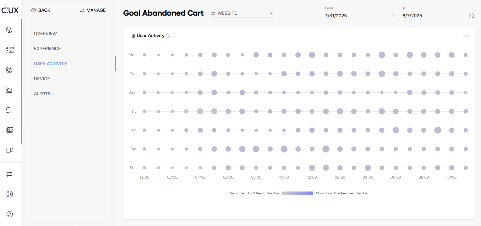
The User Activity widget helps you understand on which days and at what time your goal is most commonly being achieved. Two key elements of the widget are:
- The size of the dot - the bigger the dot, the more visits were recorded on a specific day, at a specific time.
- The color of the dot - if the dot is intensively purple, it means that a large proportion of the visits has achieved the goal! If it is grey, it means that fewer of the overall visits achieved the goal.
In case if contrast is not enough or you want to have more detailed information about goal performance during certain days and/or hours - hover over the dots with your cursor.