October 28, 2025
10 min read
Stop losing users. Find and fix website frustration points
Frustration is a universal experience, but when we speak about user frustration on a website, there is no place for mercy.

Aleksandra Pyza
Content Marketing Specialist at cux.io

Updated October 2025
Website user frustration caused by bugs, slow loading, poor design, or broken navigation drives users away; learn how user behavior analysis identifies these specific issues (like rage clicks) to fix problems and improve your conversion path.
A bad user experience is driving users away, faster than you think. Industry studies consistently show a significant percentage (often cited around 30% or more) of users will abandon a brand after just one bad digital experience. Why? Because users abandon sites when they reach a certain level of frustration. Or even worse! They never come back, after a lousy user experience.
Hey, cheer up! YOU have nothing to worry about. In this blog article, we will explore different methods and tips on how to turn frustration into a positive experience. And, of course, keep customers coming back for more. But before we do that, let’s find out what are the most common reasons for frustrations.
The 4 most common causes of user frustration on a website
1. Unreliability = Bugs
Nowadays, a company's credibility is mostly judged on its website. Bad UX design, broken links, complicated purchase process, and flawed navigation are the sources of users' frustration. According to clutch.co, users’ primary site frustration is its unreliability. 54% of users will stop using the site if they find it unreliable. And if this problem persists, nearly 63% of visitors will ditch a site permanently. Confused users are not likely to complete the conversion path.
Under unreliability, customers might find broken links, 404 errors, and other bugs like non-clickable CTA. No one likes to reach a dead-end, especially when they have a purchase intention. Each error reduces the company's credibility and is viewed as a red flag. There is no doubt that those bugs can only do harm to your business.
2. Slow page loading
A long page loading time might be the first issue that your users are facing. And it’s the second most frequent reason for users’ frustration.
Site performance measures the time it takes to load content on the website when the user clicks on a link. Imagine, you type the web address, and a blank page opens. And you wait and wait. Just like Tom Hanks waits on the bench in Forrest Gump. The time is running and still… nothing has happened. 83% of customers expect the site to load in less than 3 seconds! 1 out 4 of visitors would abandon a website that will do it in just 4 sec.
But slow page loading not only frustrates users, but also affects your SEO performance. The Google algorithm prioritizes high-speed pages. You can check your page performance on Google’s PageSpeed Insights tool.
3. Too much generic content
You might think that offering more options to users usually makes them more satisfied and will speed up the purchase. It won't. Quite the contrary.
Choice overload can leave your users frustrated and cause attention problems. Customers’ eyes don't know where to focus. The mouse cursor exhibits chaotic movement, sliding through elements – a clear signal captured by user behavior analysis (UBA).The user's ability to make decisions goes out the window because everything is so distracting.
So, have you ever heard the expression, “less is more”? The user must have clear guidelines of what you want them to do. That's why your site's user interface should be designed according to user experience commandments. For example, legible CTA buttons, no-overwhelming content to make them want more, and intuitive site navigation.
4. A broken “back” button or its complete absence
How many times were you about to finalize your purchase, and at the last moment, you decided to change the delivery method? You start looking for the back button. Your frustration starts to rise. After a few seconds of searching, you realize that there is no such thing as a back button, or it doesn’t work. You’re losing your cool.
Take a deep breath. There is always a back-button option in your browser. You close your eyes and start to pray that the completed form will reload again. The site does. And you can't believe what you see! Not only did all the form fields go blank, but the same happened to the whole order. Your frustration level plumbs new depths. There is no chance in hell that this purchase will have a happy ending.
Practical Example: Imagine your overall tracking website analytics show a high bounce rate on mobile for a key landing page. Using behavioral analytics tools, you filter visit recordings for mobile users landing on that page. You observe many users repeatedly tapping the screen (rage clicks) or hitting refresh (user frustration) shortly after landing, before leaving. This user behavior analysis strongly suggests slow mobile loading speed is the culprit, allowing you to prioritize image optimization or server improvements specifically for mobile, directly addressing the identified friction point in the user flow.
Detecting user frustration using behavioral analytics (experience metrics)
You already know the most common reason for user frustration, so how to search and get rid of them? In order to spot user frustrations causes, you need to find behavioral patterns. And Experience Metrics will permit you to do that.
Experience Metrics is a cux.io feature that allows you to discover places on the website that make users angry and frustrated. You can track frustrations that may inhibit your conversion on the CUX dashboard immediately after logging into the app.
Thanks to CUX's Experience Metrics, you can track chaotic mouse movements, zooming content, rage clicks, or rage key presses. You will immediately find that something wrong is happening on your website. And customers have difficulties trying to deal with it.
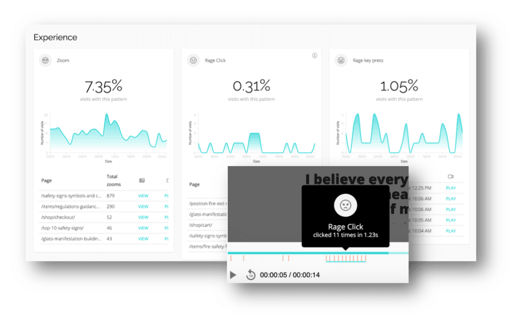
Rage clicks
When users press a tremendous number of clicks in a short period of time, it means they just experienced a rage click. And it’s not a good sign. Shortly, it means that there is no computer response.
One of the website elements that rage click appear are broken links. They also direct UX design imperfections, errors, and bugs. With metrics like rage clicks, you can immediately spot places on the site that need optimization.
Learn more about rage clicks >
Rage key presses
Rage key presses are a close relative to rage clicks. They occur when people quickly and chaotically press numerous keys on their keyboards. Rage key presses are the highest level of user frustration and can be only tracked on a desktop.
Same as rage clicks, rage key presses indicate no computer reaction.
Chaotic Movement
How to see if your user is lost? Can't find the content that he is looking for? The answer is a chaotic movement! When people start to be confused or lost — their mouse movement reflects their state of mind. They are scrolling down-up-down-up or moving the mouse in various directions without a specific goal. It reminds me of an anxiety attack.
Refreshing
You can use refreshing as an indicator for slow page load. Users get frustrated when the page is not opening as fast as they will want to. So immediately they are trying to speed this process up by pressing the F5 function key or reloading that page button in short intervals.
As refreshing, we consider at least 3-page loads in a time less than or equal to 5000 ms.
Moreover, refreshing metrics might occur to some page elements that haven’t loaded correctly or at all (like photos, graphics, links, etc.). Visitors also refresh rapidly when some parts of the page are not in their proper place.
Zooming
When something is unreadable, users are zooming it. It means that text, photos, infographics, or buttons aren’t accessible enough. By enlarging or miniaturizing the content, they are able to see or click it.
The zooming metric may also depend on the age of your target audience. If your customers are from the silver generation, it will be better to think about enlarging your content.
Zooming will also be a clue if your checkboxes need some improvements. It’s mostly applied to mobile and tablets. Because it’s common that checkboxes on those devices might be too small for users to select, or they might be too close to the edge.
How to fix user frustration with a quick win?
CUX’s Experience Metrics immediately points out what raises users' blood pressure. It's an opportunity to turn those pieces of information into a quick-win solution that eliminates users' reasons for frustration.
If you desire a fast solution that responds to the needs of your users, quick wins might be what you are looking for. Quick wins are based on the continuous observation using behavioral analytics tools and analyzin users’ behaviors. Thanks to analytics. We’re able to choose the proper solutions that allow us to make business decisions based on data, and not on the intuitions or stakeholders’ wishes.
To find out the explanations for user frustration on your website, go to the Goals section in CUX and create a new one. You can use ready-made, predefined goals or create your own custom ones. Then, map the customer journey with Conversion Waterfall. CUX allows you to analyze extensive conversion funnels based on any event.
CUX’s algorithm detects and defines user behavior patterns that may inhibit conversion. Experience Metrics allows you to spot places that cause frustration and make customers drop off the conversion funnel. CUX automatically selects visit recordings in which frustration and users’ pain points occur.
The next step is for you to analyze. Visit recordings and heatmaps will allow you to visualize the customer experience through their whole visit to your site. You will see places that cause user frustration and find opportunities for quick win optimization. Ladies and gentlemen, we are more than happy to announce that we have a winner!
It’s all about the experience
User experience is a crucial component of business growth. According to Zippia, better UX design increases a website’s conversion rates by up to 200%, and positive UX in eCommerce means 3x more customer visits.
There is nothing to wait for. REACT! Analyze your user behaviors using customer journey data, eliminate issues on your site that may cause drops in conversion, and increase your ROI! You have a real deal on the table, or should we say on your site. 😉
FAQs
Q: How does user frustration actually hurt my website's performance?
A: User frustration directly leads to lower conversion rates (abandoned carts, incomplete forms) and higher bounce rates. It damages user trust and reduces the likelihood of return visits, negatively impacting overall business goals.
Q: Can I see user frustration just by looking at Google Analytics?
A: No. Google Analytics shows outcomes (like high exit rates) that might be caused by frustration, but it doesn't show the frustrating behavior itself (like rage clicks or chaotic movement). You need behavioral analytics tools for that.
Q: What's the fastest way to find frustration hotspots on my site?
A: Use behavioral analytics filters. Start by looking at recordings or heatmaps specifically filtered for "rage clicks" or "chaotic movement" on your most important pages (like checkout or landing pages). This quickly highlights critical problem areas.