August 25, 2025
7 min read
How negative feedback leads to better UX [FREE 10 GOLDEN UX RULES]
Why does feedback play the first fiddle in UX designers work? - Leveraging Feedback for UX Improvement

In this article, we share a few essential insights about negative UX feedback and its role in the design process. Are you ready for full-rounded criticism?
What is negative feedback
First of all, you need to be aware that there are two types of negative feedback. The first one brings nothing to the table and only pulls you down. Constructive feedback, on the other hand, aims to help you improve your products or services.
Let’s say you’re a UX designer who has just redesigned the company’s site and you ask two managers for feedback.
The first one says that the UX design is bad… and nothing else. You can take this feedback out of the equation because there is no value in it.
The second one says that the user experience design is weak due to an unintuitive sequence in the check-out form and the visibility issue in the form section. Those two problems may increase the abandonment rate because people may find problems with filling it. Good UX design should make the customer journey as simple as possible.
There is no doubt that the second piece of advice is more worthwhile. The manager was specific about the issues and listed the weak points that can influence site performance later on. Now you can immediately implement suggestions from such feedback and analyze their results with the help of an analytics tool.
Why does feedback play the first fiddle in UX designers work?
Creating a piece of design can take some time. The worst thing that you can do is to close yourself from UX feedback and wait with iteration until the end of the process. Why? Because there is a slight chance that your design will not meet others’ expectations, especially your future users.
Remember you’re not designing for yourself but for users. Always look from a user’s perspective, whether you’re designing a new product or improving an existing one.
It’s all about communication
If you want to succeed you need to be a team player and interact with people, look for opinions and feedback. Just like in any ensemble, sport or relationship – communication is the basis.
Ask your co-workers, clients, and potential users to give you constructive criticism. It will shed new light on the project and give you ideas you might not have thought about earlier. Adding user perspective before the production phase it’s an essential part of user research and product design process.
Yes, it might be stressful to hear unfavorable opinions about your design, but this is one of the most efficient ways to improve your design skills, evolve as a UX designer and design products that users really appreciate.

What do we consider a good UX design?
In the age of consumerism, it’s hard to make a mark among the competition, but it’s still possible!
One thing that can distinguish you from your competitors is a good UX design. There are a lot of definitions and theories of how a good user experience design should look, but there are 3 elements that remain the same.
1. Simplicity
A small black dress always works because of its simplicity. Simple is more convenient for the consumer and often more enjoyable. It’s a safe solution, because complicated products are likely to have more bugs and errors.
2. Usability
According to the stats, 70% of online businesses fail because of bad usability. Nowadays, users interact the most with products that can help them accomplish their task quickly, generate lower levels of stress and have fewer bugs and at the same time provide users’ satisfaction.
3. Visual aspects
Don’t judge a book by its cover – this saying doesn’t involve the website's designs anymore. Users are visual creatures now more than ever. Right now it takes about 0.05 seconds for users to judge whether they want to stay on the site or not.
Remember that one way to win users’ hearts is to please them with a good UX design. 💘
If you're eager to enhance your users with flawless UX even more, download our free 10 Golden UX Rules e-book.
How to become a better UX designer?
Don’t flee from negative feedback
It’s a perfect occasion to find quick wins. Nine times out of ten, negative feedback, user frustration and bad emotions indicate spots that lead to bad UX design and cause conversion drops.
One way to find out the user frustration is to look for Experience Metrics like rage clicks, rage key presses, zooming, refreshing or chaotic movement. All of them clearly point out bad design decisions that, in the end, lead to user frustration.
Advantages of Experience Metrics
You don't have to wait for a bad review in your Google Business Profile or set up an anonymous survey. There is much an easier and more efficient way to do it.
For example, look for rage clicks on your product page, because they occur whenever a user clicks the mouse numerous times in a very short period and gets no response. It’s a sign of user frustration.
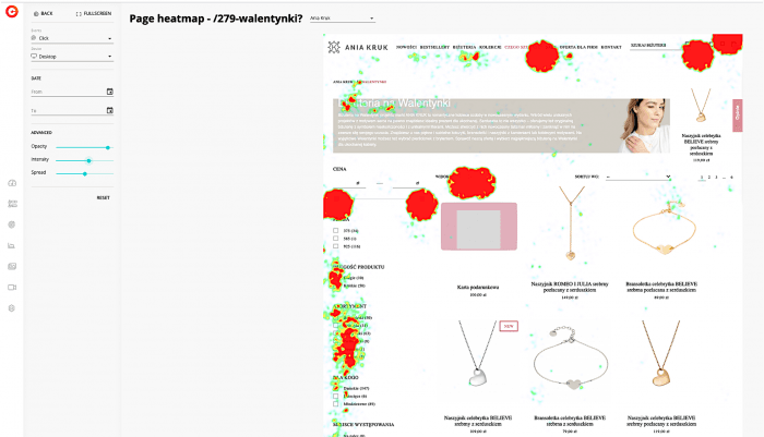
In cux.io there are 3 easy ways to find rage clicks – on the dashboard, heatmaps and visit recordings. After login into the app, for instance, go to the heatmap section. Filter heatmaps by specific type of event – rage clicks and the list of results shows up. You can switch the device type to see if angry behavior happens only on mobile devices, desktop or both.

Be curious
Act like you are still 2 years old and repeatedly ask “why?”.
- Why do users behave this way?
- Why didn't they interact with the button that you designed for them?
- Why can’t users fill the form?
- Why isn’t my business achieving our goals?
Always ask “why”. No matter how childish or basic these questions may seem, ask them! That’s how you can reveal gaps in UX design, find behavioral patterns and spot missed opportunities. Simple solutions are sometimes the best.
Strike up friendship with analytics tool
Let’s be honest, it’s not easy to collect high quality feedback with constructive criticism. Surveys, iterations, opinions are often time-consuming and they don’t provide credible information. There is a much easier, faster and efficient way to gather quality insights about your project.
An analytics tool will tell you the truth about your users and their behavioral patterns. It will indicate problems that may cause drops in conversion or find bottlenecks and users’ pain points, in a matter of minutes!
Use analytics tool like CUX to win your customers hearts by:
- Watching visit recordings – Filter list of visit recordings by specific frustration like rage clicks, zooming or refreshing to find places that may lead users to churn.
- Analyzing heatmaps – discover how users experience your page on different devices and track most significant actions and elements on your pages.
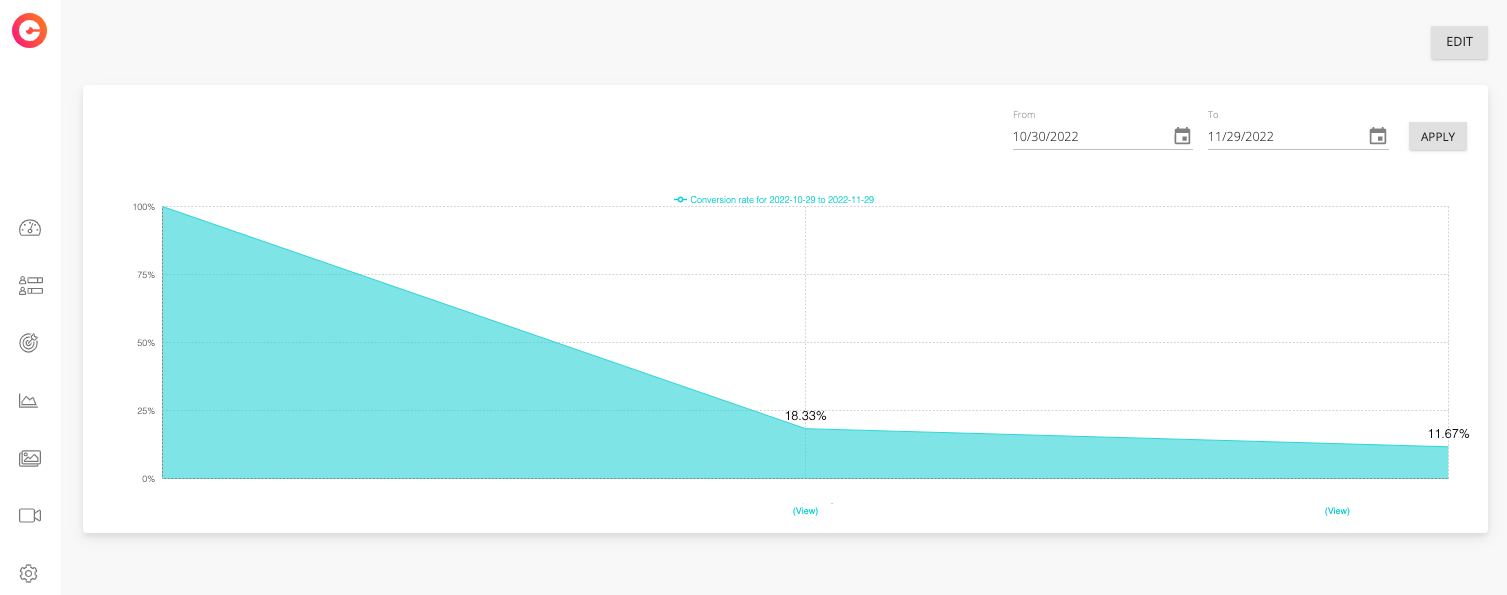
- Understanding conversion drops – analyze the list of recordings assigned to each stage of your conversion funnel. Examine those visits to see behaviors of the users who left your site.

Conclusion
To truly excel and gain a competitive edge in the digital landscape, it's essential to actively seek user feedback, integrating it seamlessly into your design process for tangible UX improvement. It’s no longer optional, it’s a must.

