August 19, 2025
4 min read
Why grouped heatmaps are the only thing your Analytics is missing?
Seeing places on your website that are specifically disturbing for your user can in fact save you a lot – not only analytical trouble but also your high CRO.

Kamila Kotowska
Head of Growth at cux.io

Heatmap, what it is?
Let’s get back to basics. What are those mysterious heatmaps and how they’re helping your analytics reach the next level? A heatmap is a graphic representation of users’ most significant actions on your pages. Every single activity – like a click or mouse move, scroll, chaotic movement – adds to the hotness of a given area, and any recorded move makes the area even hotter.
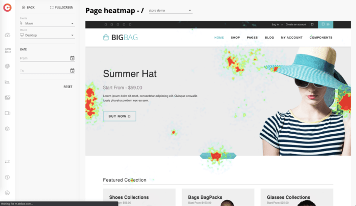
Heatmap from e-commerce store
Those high activity places are marked in warm colours, red being the big city, and those with fewer users’ movement are shown as cold – blue representing quiet village life. Every colourless place is the spot which skips the user’s attention and is not causing any action.
Why should you track heatmaps?
First of all, there’re times when your customers get very frustrated with your website or app, and they click somewhere a hundred times just to wreak their anger. Heatmaps come to the rescue as they help you understand when visitors love what they’re seeing, and when it’s a simple “NOPE, THANK YOU”. This is a goldmine of insights on your way to understanding user preferences and behavior.
Moreover, heatmaps can show you the most valuable things that happen on your website like places where people click and where they cannot click – even if they were supposed to. You’ll see click on things that aren’t links and rage clicks. When read correctly those little colourful stains can point you to some broken links on your site or even identify missed opportunities to have links (dead clicks).
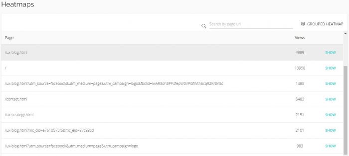
In your analytical routine, heatmap should mean a quick overview which helps to formulate hypotheses for further analysis. While choosing a heatmap tool, always pay attention to the methodology (what does it exactly visualize, how many events are needed to get a meaningful heatmap), possibility of filtering by a date range and focusing not only on single URLs. “Why?” – you may ask?
The more the merrier, grouped merrier is your rescue!
This happens a lot: visitors land on your pages using links embedded on different sites – let’s say from your Facebook page. Each time you share a link to your site on Facebook and someone clicks the link there, they will end up on your page using your URL and a fbclid parameter. For analytics tool each of such visits looks like a visit to a different address and generates a different heatmap. That’s when grouped heatmaps come to the rescue!
By using CUX you can group them to see an overview heatmap enabling you to see the same page shown to visitors using different entry points. Even though you’re able to view them as regular heatmaps, the hot and cold areas will be shown for more than one page. Isn’t that grand!?
Note that this magic, however, only applies to pages with the same layout!
Layout is important, but only smart {layout-is-important,-but-only-smart}
Our websites very often consist of very similar pages, most of them based on a similar template – their layout and object placement stay the same. The only difference between them are images and the actual content. In an online store, these may be, for example, product pages or shopping cart views. If you want to check how effective the layouts are, grouped heatmap will definitely help you do that.
ROAS is one thing, but campaign analysis is a different story
Thanks to the usage of grouped heatmaps, you can easily collect all visits to the website from a given paid campaign in one place – you owe it to the possibility of filtering by a parameter of a given campaign, e.g. fbclid or gclid (from Google).
On the other hand, when you work on various campaigns simultaneously directing user traffic to different pages – e.g. on behalf of a marketing agency – you can also filter the results of your grouped heatmaps by specific date ranges (including using historical data).
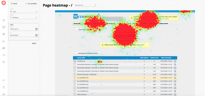
Heatmaps filtered by dates (even using historical data)
Grouped heatmaps – looking like regular heatmaps with the same controls and settings, and data aggregated from several pages – not only help you overcome technical constraints, but also add a very different and more specific angle to your observations.
Want to harvest the freshest analytical crops? Sign up for the cux.io nourishing newsletter! Be careful! We may grow on you! 😉