70% frustration drop in InsurTech – PZU x CUX Case Study
List of Contents
Drop us a line or two:
Summary
PZU Group is one of the largest financial institutions in Poland and in Central and Eastern Europe that was first established in 1803. With previous experience of user analytics through tools such as Google Analytics, they were looking to extend their analyses by meaningful behavior analytics, and combine the previous quantitative measures with qualitative ones.
Industry
Insurance services
Market
B2C
Location
Poland
Scope of Work
Customer journey optimization, Identifying pain points
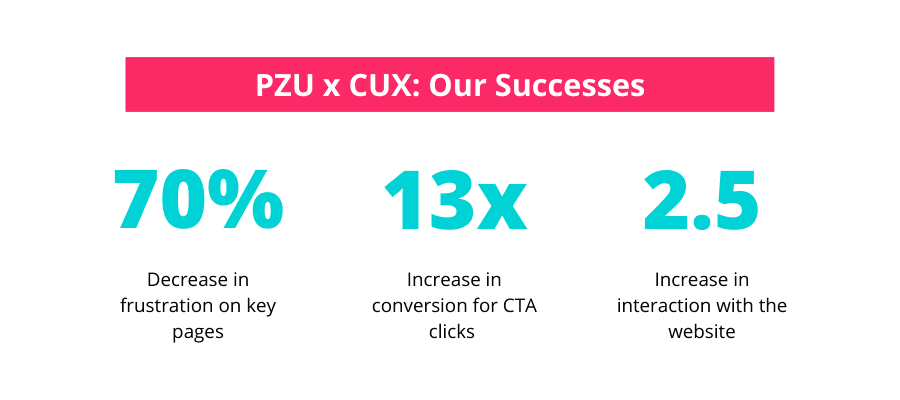
As PZU was looking mainly to gain more behavioral insights from their customers, they used advanced CUX features to find the frustrations and adapt the website to the needs. Before using CUX, they planned that the website analysis and adaptation will take 12 months. However, thanks to the collaboration, they managed to decrease the time to only 4 months and gain immediate results. The effects include:
- 70% decrease in frustration on key pages.
- 13x increase in conversion for CTA clicks (from 0.6% to 8%).
- 2.5x increase in interaction with the website.
Goals
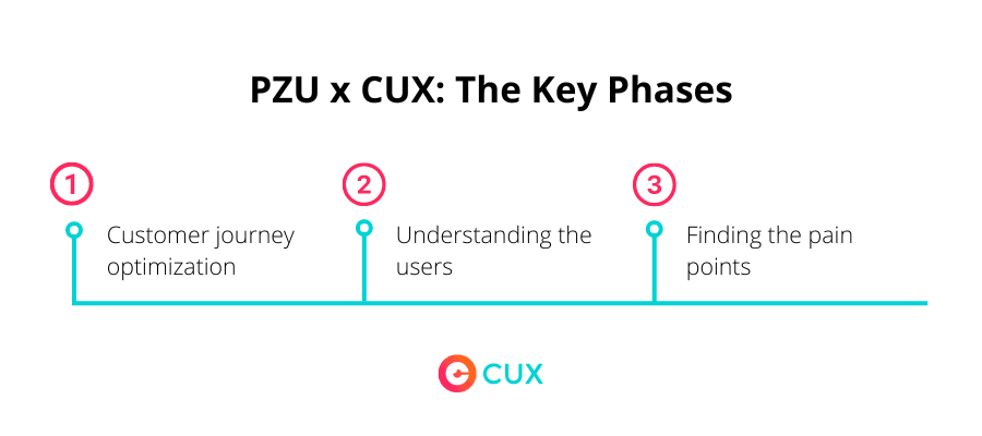
Customer journey optimization
PZU aimed to better understand the steps their customer take on their website and measure whether their initial hypothesis regarding ideal customer journey was accurate. Afterward, they hoped to optimize the journey to provide a seamless and effortless experience on the website.
Understanding the users
Even though PZU is well experienced with data and traffic analytics, they noticed a need for a deeper understanding of their website users, including their behaviors, preferences, and needs. Even though they had previously conducted numerous quantitative analytics, they were hoping to get more insightful results of WHY the customers behave the way they do, and if there are any needs that are currently not met.
Finding pain points
The company at first didn’t know what elements exactly could be causing issues for the users. They had some understanding of the issues their customers might be facing because of low activities on contact form and “My PZU” button, but they were looking to deeper analyze the exact steps that cause these parts to be problematic.
Scope of work
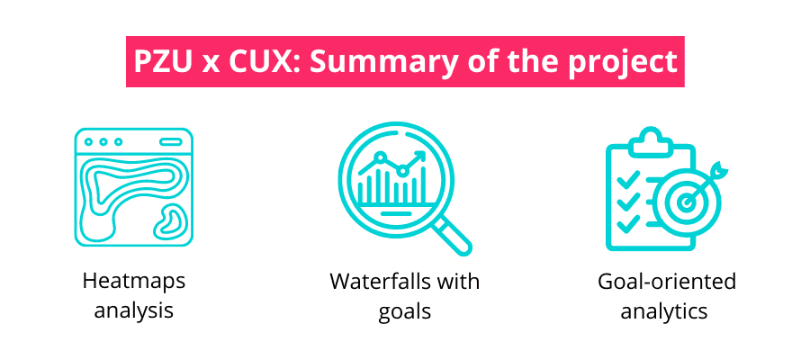
Heatmaps
- Finding the “hot spots” on the website, focusing on pop-ups and buttons.
Waterfalls
- Utilizing the feature for the analysis of complex goals.
- Finding out why users are not clicking on the desirable elements, and most importantly, what is the reason behind it.
- Analyzing the customer journey (and its complexity) step by step, including the drop-outs and bottlenecks.
- Using the “Find out” option to see individual session recordings specifically for users that didn’t follow the desired customer journey to understand what caused it.
Goal-oriented analytics
Analyzing the differences in performance between desktop and mobile devices to optimize the user experience on both.
Results
“My PZU” page clickability increased 13 times
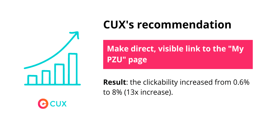
The main goal for PZU was to successfully direct the users to “My PZU” page, where they can log in or create an account and purchase the product. Before using CUX, that button was hidden on the left corner. However, after analyzing the waterfalls and sessions, it turned out that the option wasn’t as intuitive as it seemed. The users were not clicking the “Log in” button, which would take them directly to “My PZU” page. Instead, they were going to Help Center to look for the link there. Therefore, the conclusion was: we have to make the journey easier by making direct, visible link to the page.
After implementing a prominent box on the top of the page to test the hypothesis, the clickability increased from 0.6% to 8%, proving that the visibility was a pain point.
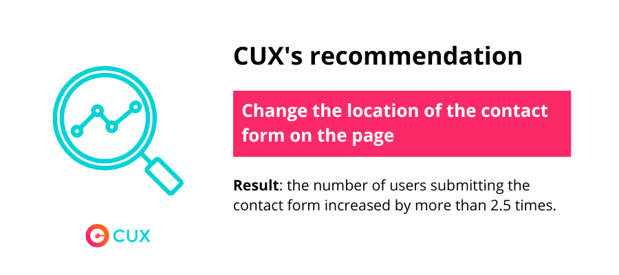
Contact form usage increased 2.5 times
By making a strategic change to the contact section on their website, PZU significantly improved user engagement and accessibility. Previously located on the left side, the contact form was not centrally positioned and even disappeared on mobile devices. However, after implementing the modification, the number of users submitting the contact form increased by more than 2.5 times compared to the previous state. We can call this a quick win - thanks to a small change on the website, PZU immediately responded to the needs of their clients.
Customer journey optimization
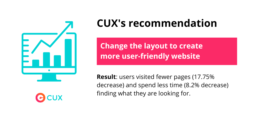
PZU’s set a clear goal for the analysis - we want to understand the users and their journey, and ultimately shorten and simplify it. To do so, they set a hypothesis: increased usability and easier navigation will help customers find faster what they are looking for. In other words, if the number of pages opened and session time both decrease, it’d mean that the user was satisfied faster. After CUX analysis, they discovered that by changing the location of the boxes, they were able to change the way customers explore the page. Before, the average number of pages visited before finding the contact form was 2.31. After implementing the changes, it decreased to 1.9 pages per user, which is equal to 17.75% change. Moreover, the average visit time on that page decreased by 8.2%. Therefore, thanks to the changes, the users were able to find quicker and easier what they needed.
3x shorter analytics time
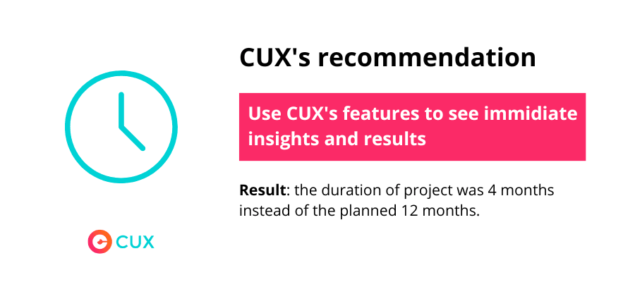
The company knew that there is something wrong with the “My PZU” page and the contact forms even before they started using CUX - the numbers were not high enough to be satisfied with the results. It was clear that these parts of the website needed change, but the issue was “how?”. Before discovering CUX, the team was planning to intuitively try different scenarios, hoping that one of them would actually work and increase the clickability and form submissions. According to the team, this “trial and error” method would take approximately a year to bring the results they wanted. With CUX, they were able to skip steps and follow the decisions backed up with data and facts from the very beginning. Thanks to that, the analysis revealed the changes they needed to make almost instantly, and the process of improving the website took only 4 months.
Impact
KPIs, customer satisfaction, sales etc. Specific measures or results that were improved.
Testimonial from the client
“CUX enabled us to introduce the customer's perspective to our website. We've obtained the first analytic's conclusions in just a month!”
“Previously, we analyzed websites from the Google Analytics perspective. It quickly showed us that certain sessions do not go along quite as we would like them to. We knew something was wrong and worked through trial and error to find the problem. Now with CUX, we can quickly locate those issues.”
Final Checklist
- Enhanced visibility and usability of the contact page, resulting in a 2.5x higher usage rate
- Increased “My PZU” clickability by 13x thanks to changing the location of the button
- 70% decrease in frustration on key pages
- Improved the website 3 times quicker than with traditional methods, saving money and resources
- Users visited fewer pages (17.75% decrease) and spend less time (8.2% decrease) finding what they are looking for.
- Optimized customer journeys thanks to insights from behavior analytics
- Improved understanding of user behavior on the website
- Combined quantitative and qualitative analysis effectively
- Made informed decisions and optimized website performance based on real user insights.
Start your FREE Trial today and start improving your digital user
experience with data-driven decisions.