August 25, 2025
10 min read
E-commerce product page optimization
A product page of an e-commerce store is where the customer first comes in contact with the product offer. It’s the product page where the entire purchase decision-making process takes place.

Will the customer feel captivated by a well-thought-out design of the page, attention to detail of their experience, and complete the path to conversion?
Or will they take one look at what your e-commerce page has to offer, and jump right to your competitor's website, never to be seen again?
This will be determined by how well you can optimize your product page to suit your customers’ needs and expectations. Read on to make sure you know what to do and what to avoid when working on product page optimization.
What is a product page
Product page is a page of the eCommerce store that provides a customer with information about a particular item. A product page will normally contain all crucial product details, customization options, and a call to action.
Contrary to a traditional point-of-sale, such as that in a physical store, customers of an eCommerce store cannot touch the product or seek the immediate assistance of a store clerk.
Therefore, the product page is the main point of contact, and its job is to provide the customers with enough information and to persuade them to proceed with a purchase.
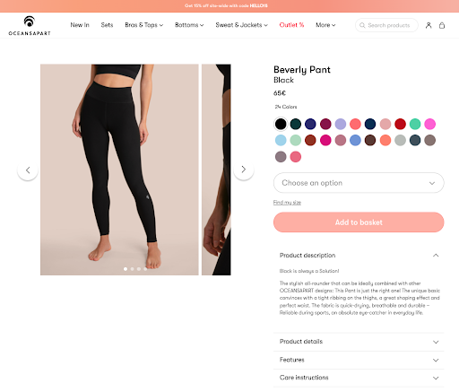
Source: Oceansapart
The 5 necessary elements of every product pages
As we mentioned a few paragraphs earlier, there are some crucial product details that every product page should consist of. Let’s have a quick look at them.
The product itself
Product is obviously the centerpiece since this is its first chance to shine, so it’s crucial how it’s presented and what questions your customers have before they can commit to buying.
In this part, it’s critical to demonstrate how your product is different (if it’s possible) from your competition. But you can also take advantage of your e-commerce business. If you offer free delivery or different payment methods don’t hesitate to highlight this information.
Product presentation
People are visual creatures which means they buy products with their eyes. Use high-quality product images to stand out from your competitors. Or go even further and present your offer by showing product videos.
If you don’t have a professional camera to provide such content, ask your provider or product owner to deliver high-quality images. I’m sure it’s just a matter of a few emails and can increase conversion rates easily.
Your copywriting
Copywriting is extremely important for your product page. The way you convey information about your product will heavily influence your potential customers.
Good copywriting will make the customers feel well-informed and reassured. Bad copywriting may make the customers feel confused, and detract them from making a purchase altogether which automatically lowers conversion rates.
Your user experience
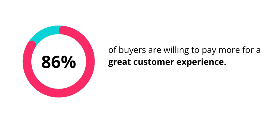
The user experience (UX) on the product page of your online store has arguably the biggest impact on your conversion rate. Offering highly desired products at bargain prices it’s no longer enough.
Now more than ever customers pay attention to the experience that e-commerce offers them. UX can be influenced by anything from a SEO, load time, to quality of product images and amount of customer reviews.
Here, you can read an article how to optimize your e-commerce in 6 simply ways.
The brand
Your brand is what makes your products special. It gives your products additional sparkle.
In the end, it's the brand that creates emotional bond between you and your customers and allows you to develop a meaningful relationship in the long run.
What is product page optimization and why is it important?
The reason why an e-commerce product page needs to be optimized is very simple; your customer's first encounter with your product page is like a first date.
You want to make a very good first impression, otherwise, you are likely to never see each other ever again. Just like that. Plenty of other fish in the sea for your potential customers to choose from.
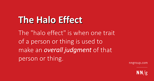
This is also known as the “Halo Effect”. Based on the very first impression, customers can draw overall conclusions about your brand.
That’s why your product page's design, usability, and navigability must be at the forefront of your mind – without it, your conversion rate will never reach its true potential.
How do I optimize my e-commerce product page?
You want your product page to make your customers think just like Homer Simpson. But the road to crafting irresistible product pages is not a short one, nor a simple one – but it’s so worth it in the long run.
What it will take for your product page to drive conversions you can be proud of, is consistently and attentively following a number of simple principles necessary to optimize your product pages.
Below you will find 6 ways to optimize your product pages, so let’s dive in!
1. Understand your customers’ needs and frustrations
Understanding your customer's needs and frustrations is the first step to kicking off any optimization process, and it certainly applies to improving the customer experience on your eCommerce product pages.
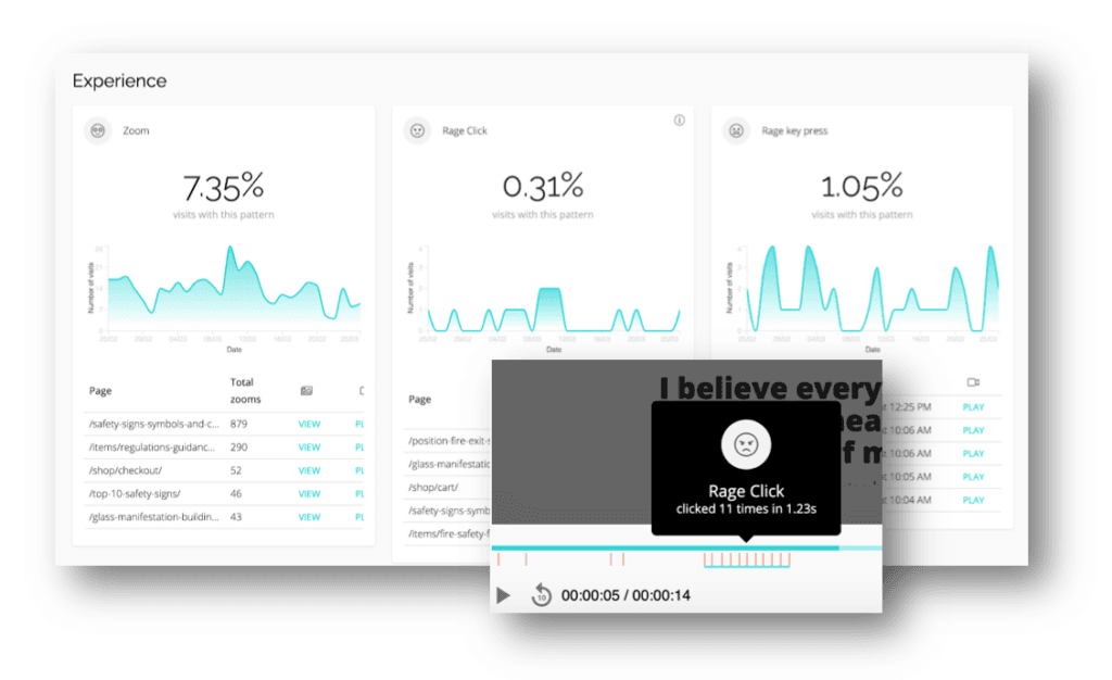
In order to do that, you must be able to analyze the user behavior on your eCommerce site. Track indicators like experience metrics that point out user frustration through user behavioral patterns like zooming, chaotic movement, rage clicks, rage key presses and refreshing.
2. Provide social proof and reviews
Product reviews are incredibly important for any eCommerce business. Your potential customers will seek out previous customers' reviews to support their own decision-making process. And if they find none? The alarm bells will start ringing in their mind!
An average visitor needs reassurance when making a purchase in a newly discovered eCommerce store, so make sure they feel as much at ease as possible. Customer reviews do a fantastic job in convincing your potential customers that they are indeed right when making a purchase decision.
3. Product page SEO
Your search results should always be on point. Why? Inaccurate product descriptions are not only unprofessional but actively hinder product discovery for your potential customers. Organic search engines are like bread to butter for your eCommerce sites.
According to statistics, 81% of consumers conduct online research before shopping online.
That’s why you should consider Search Engine Optimization (SEO) as one of your closest friends. Pay attention not only to product descriptions but also headliners, images description, meta descriptions, meta titles and structured data.
4. Gamble on a clear call to action
Calls to action (CTA) must be clearly noticeable, as it is a core element of the customer journey. In e-commerce interfaces, CTAs are the core factor of effective interaction with the product.
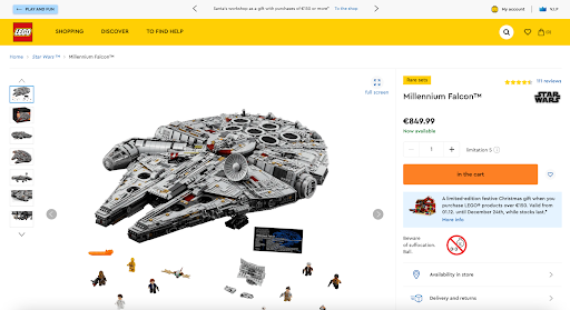
Source: Lego
Without clear instructions on what should be the next move customers feel distracted. They are lost and decide to abandon your online store. In this case, optimize your product pages by checking heatmaps and watching visit recordings.
They might give you hints for optimizing your product page. Look for indicators like chaotic movement or rage clicks that clearly point out user frustration.
5. Is your product page mobile responsive?
Consider thinking twice before answering this question. Even if you think that your eCommerce shop is fully mobile responsive, just because the design adjusts itself to mobile devices, there may be some hiccups that you have yet to notice.
3 things that often hinder the mobile experience of product pages include:
Too small text or images – this forces customers to zoom in on the content of the product page, as they are unable to view it correctly in its original size.
Unclickable elements – it’s one of the customers’ nightmares. They put a lot of effort, and frustration into making those elements clickable by pressing them numerously in a concise period of time.
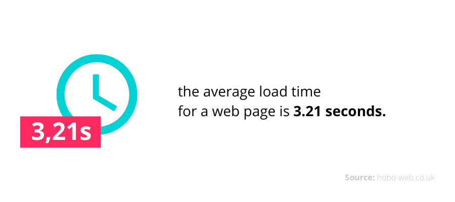
Too slow web load time – more than 70% of online customers admit that the product page speed impacts their willingness to purchase.
6. Focus on easy navigation and effortless searching
It's common to look for customer leaks in the last stages of funnel sales. Checking forms with too many fields or too small checkboxes are the first reasons why customers are leaving.
But the reason why they abandon the purchase process might appear way earlier. Our customer, a polish jewelry brand Ania Kruk, became convinced of it.
Not only do potential buyers require a flawless ending, but they also want to easily find products on your website. That’s why you should keep your search function specific and intuitive.
Instead of using the scrollbar to define price range, make use of checkboxes. Not only it’s easier to choose desirable prices but mobile users will also find it more friendly.
Cut product page optimization to the chase
Although product page optimization may seem like a heavy task, not taking it up will result in an unsatisfactory customer experience, and thus, business loss.
You don’t need to redesign your website to improve your product pages. Rather than that, you should take advantage of a user behavior analytics tool. It’s the best and most efficient way for optimization.
There are several analytic tools on the market that offer free trial subscriptions, so why not try them?
Optimize product pages with CUX
Start the product page optimization process by finding bottlenecks that have a negative influence on conversion rates.
Go to Visit Recordings, and filter your list by product page URL address. Watch a few visit recordings to find out what the real customer journey looks like and map it. Next, use Conversion Waterfall to build some sort of sales funnel. On every step of your Conversion Waterfall will appear the number of visitors who decided to drop off.
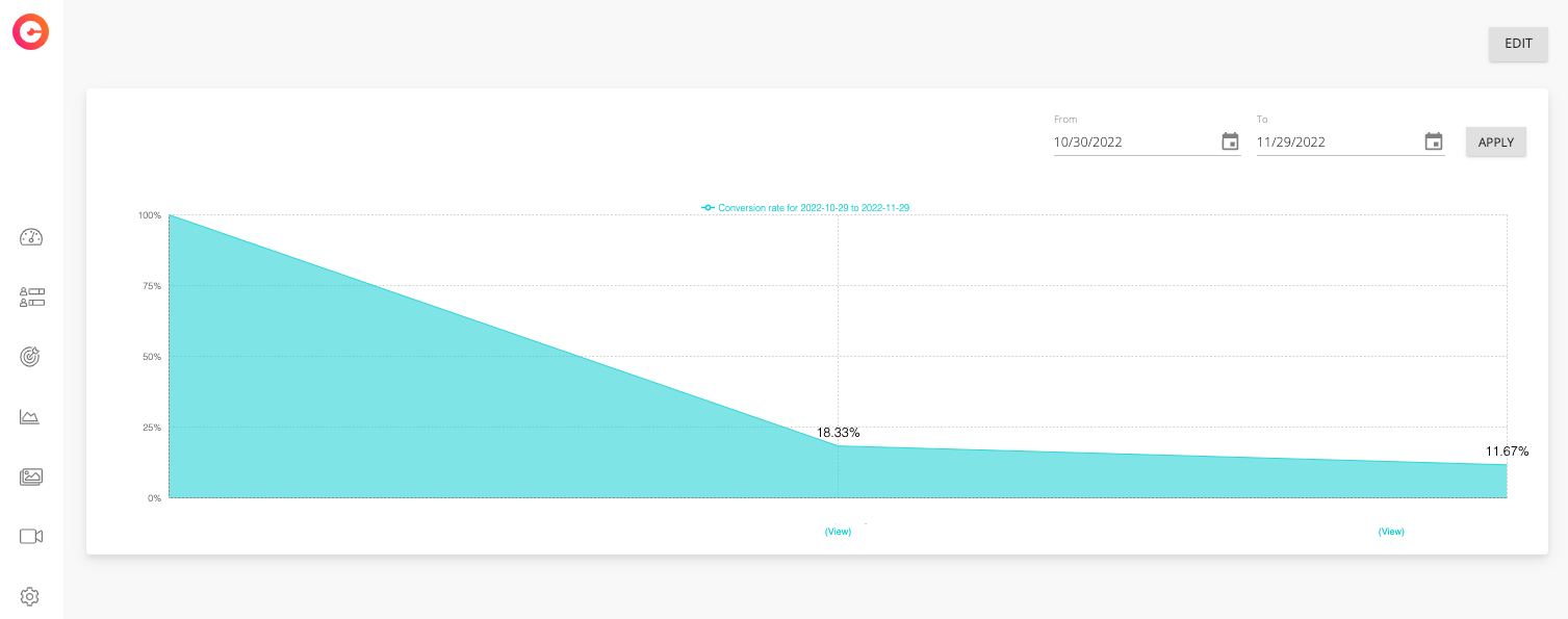
Click view to see a list of visits recordings of visitors who abandoned the site. Analyze them to see what was the cause and implement changes.
What makes a great product page?
There is no doubt that the product page optimization process is a real game changer. Especially when we apply it to such a business as e-commerce.
To not get confused with all the valuable information provided in this article we decided to prepare a short checklist you should always keep in mind, whenever you improve your product pages.
What good e-commerce product page should contain:
- flawless navigation,
- clear call-to-action,
- SEO-friendly product description,
- high-quality images of the product
- fast web load time,
- social proof and reviews,
- high-quality content that flatters your product,
- shipping information especially if you provide a free shipping option,
- information about payment methods,
- the possibility of upselling and cross-selling.
And that's how you make online shopping great again!

