November 5, 2025
7 min read
Decode your visitors with Experience Metrics
Ever spend hours crafting the perfect landing page, only to see bounce rates skyrocket? Traffic seems good, but conversions are lagging. The design looks polished, yet users just aren't clicking where you expect them to. What's the missing piece?

Karolina Szafarz
Head of Marketing at cux.io

Experience Metrics are automated user behavior analysis signals that instantly identify specific points of user frustration (like rage clicks or chaotic movement) on your website, pinpointing exactly where the conversion path is broken.
What are CUX Experience Metrics?
Experience Metrics in CUX provide you with all of the most relevant data regarding your visitors' overall experience on your website. CUX's algorithm detects user behavior patterns that may indicate technical or usability issues (points of user frustration) on your website. These frustrations are then presented as actionable metrics, pinpointing specific pages and user behaviors that need attention. Essentially, Experience Metrics empower you to proactively enhance your website's user experience, ensuring that visitors feel satisfied and engaged rather than frustrated and driven away.
Why user frustration matters more than you think?
Ever felt the urge to scream at a website that just won't cooperate? You're not alone. Website frustration is the ultimate mood killer, turning happy browsers into click-abandoning rage-quitters faster than you can say "404 error." And these frustrated visitors aren't just annoyed... they're lost leads and missed sales opportunities and a broken conversion path. By identifying and addressing points of frustration, you can create a smoother, more enjoyable user experience that keeps visitors coming back for more.
8 types of Experience Metrics and what they reveal
Zooming
When users zoom in or out on your website, it's a sign they're struggling to see the content clearly or interact comfortably with the user interface. For example, a user might repeatedly pinch-zoom on product images, indicating that they need a closer look to make a decision.
Trigger: Poor image quality that lacks sufficient detail when viewed on a mobile device.
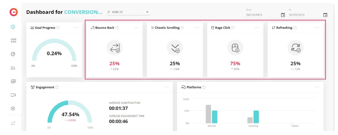
Rage Click
This metric lights up when users repeatedly click in frustration, often signaling a problem with usability or functionality. For instance, imagine a user trying to submit a form but encountering errors, leading them to angrily click the submit button multiple times in quick succession.
Trigger: Confusing button placement, unclear form instructions, technical errors that prevent form submission.
Rage Key Press
Similar to Rage Clicks, a spike in Rage Key Press (rapid key mashing on desktop) might suggest a frustrating form field or login process that isn't user-friendly.
Trigger: A login form requiring overly complex passwords or special characters, a form field that doesn't accept valid input, technical glitches preventing form submission.
Refreshing
Users refreshing a page repeatedly may indicate issues with content loading or navigation. For instance, if users keep refreshing a checkout page, it could signal confusion or errors in the payment process.
Trigger: Large image files or unoptimized code causing slow loading times, server-side errors preventing the page from loading properly.
Chaotic Movement
Imagine a visitor's mouse cursor darting around erratically on a product page. This Chaotic Movement suggests confusion, broken user flow, or difficulty finding relevant information. The product page layout might be cluttered or overwhelm visitors.
Trigger: Confusing navigation menus, overwhelming product listings with poor organization, lack of clear calls to action.
Chaotic Scrolling
Rapid, up-and-down scrolling is a classic sign of Chaotic Scrolling. This might indicate content that's too long, poorly organized, or lacks a clear hierarchy, making it difficult for users to find what they need - a common issue in a complex customer journey map.
Trigger: Extremely long blog posts without proper section breaks or headings, content that lacks clear visual hierarchy, information overload with too much text and not enough visuals.
Dead Clicks
Have you ever clicked a button that looks clickable but doesn't do anything? Dead Clicks expose these phantom elements on your website. These could be non-clickable images or broken buttons that frustrate users and disrupt their browsing flow.
Trigger: Broken links, buttons with outdated functionality.
Bounce Back
Bounce Back specifically refers to a single-page session on your website. The visitor landed on a page but didn't interact with it further (clicking links, scrolling down, filling out forms) and left immediately.
For example high Bounce Back rate on a specific blog post could indicate irrelevant content or a misleading title that doesn't accurately reflect the post's content. This leads visitors to leave the page immediately after landing on it. This is also often a failure of campaign orchestration, where ad copy and landing page content don't align.
Trigger: Misleading title or description that doesn't accurately reflect the content, content irrelevant to the visitor's search intent, slow loading times, mobile un-friendly design.
Become a UX master: embrace data and curiosity
Don't be afraid to dig deep into your Experience Metrics! The more you understand how users interact with your site, the better you can make it. Here are some bonus tips to become a UX champion:
- Be inquisitive! Always ask "why?" Why did users abandon that form? Why are they scrolling so erratically? The answers to these questions will guide your improvements.
- Befriend bheavior analytics tools! Experience metrics are gold, and CUX is the best customer analytics platform in the business for uncovering them. Use the power of data to become a UX legend!
Where to find Experience Metrics in CUX behavior analytics platform
CUX conveniently places Experience Metrics in several key areas for easy access and analysis.
Dashboard
Provides a quick overview of user frustrations relevant to your chosen goals. Ideal for a high-level understanding.
Experience Metrics Tab
Offers a deep dive into all metrics, including percentages of visits with specific patterns, distribution over time, and URLs where these patterns occur most frequently. Great for detailed analysis.
Goals Section
Focuses on visits that achieved specific goals and highlights Experience Metrics relevant to those successful sessions. It's a great way to understand what's working and what needs improvement.
Heatmaps
Heatmap is a visual representation of users actions, based on events like clicks, link clicks, or mouse movements. Plus, you'll also spot some Experience Metrics like Rage Clicks, Dead Clicks, and Zoom on the heatmap. To make it even more useful, you can filter heatmaps using the Experience Metric filter on the Heatmaps page.
Visit Recordings
And if you really want to get up close and personal, take a look at the visit recordings. Visit recordings provide a detailed playback of individual user sessions on a website, capturing the user's entire journey with all interactions and Experience Metrics. When an Experience Metric is detected during a session, you'll see it highlighted as a pink indicator on the timeline of the CUX player. Additionally, the filter option allows you to filter recordings based on specific Experience Metrics.
All-in-one user experience insights with CUX
CUX empowers you to unlock the full potential of your website with everything you need for user experience optimization. From detailed heatmaps to comprehensive visit recordings, CUX provides a wealth of data to inform your decisions. By leveraging Experience Metrics, you can identify pain points, prioritize improvements, and ultimately increase conversion rate by enhancing the overall user experience.
FAQs
Q: How are CUX Experience Metrics different from a standard metric like bounce rate?
A: Bounce rate shows what happened (a user left after one page). Experience Metrics, like chaotic movement or rage clicks, provide the context and show the specific user frustration (the why) that may have caused them to leave.
Q: Do CUX experience metrics also find problems on mobile devices?
A: Yes, they are crucial for mobile. For example, the "Zooming" metric is a strong indicator that users are struggling with unreadable text, small buttons, or images on a mobile screen, signaling a poor responsive design.
Q: What are the most common causes of these frustration metrics?
A: User frustration metrics typically reveal specific website problems. Common causes include confusing navigation, technical bugs (like broken links or non-working buttons), misleading design elements (like images that look clickable but aren't), and slow page loading times.