October 30, 2025
9 min read
Cost of confusion: How a misunderstood website feature sank conversions by 12%
Not every conversion problem announces itself with errors or alerts. Sometimes the biggest revenue losses come quietly, hidden in patterns no traditional dashboard can spot.

Agata Olbrycht
Content Marketing Specialist @ CUX

TL;DR
- High-performing pages can hide deeper UX issues that tank your metrics
- Behavioral insights reveal what dashboards miss, like silent drop-offs or missed cues
- Fixes don’t always require a redesign; sometimes it’s just about communicating better
- The earlier you catch unclear interactions, the faster you fix customer journey and recover lost revenue
Spotting hidden drop-offs before the numbers tank
It’s the middle of the quarter, and something’s off.
A few weeks ago, your company launched a much-anticipated feature: a "Build Your Own Bundle" tool. The idea was to let users mix and match products: think skincare sets, gear combos, or curated book packs, to boost both engagement and cart size. Internally, this was positioned as the big Average Order Value (AOV) play of the quarter. Higher flexibility, higher value per order. Everyone expected it to drive up revenue.
Instead, the weekly report drops with a gut punch: Average Order Value is flat. Worse, the overall Conversion Rate has fallen by 12%. What was supposed to be the quarter’s crown jewel is quietly sinking the ship.
No one’s panicking yet, but the unease is spreading. Something isn’t working. And no one knows why. That’s the gap between performance analytics and customer experience analytics. The traffic is solid, so marketing’s off the hook. There are no bugs, so engineering shrugs. From the outside, everything looks fine. But conversions are bleeding out, and the reason isn’t loud. It’s hidden in user behavior: silent exits, paused scrolls, abandoned clicks. To find out what’s going wrong, you need more than dashboards. You need behavioral data. Conversion rate optimization starts with understanding how people actually move through the site.
The first clue: Following the digital footpath
The first step is to map out the user journey.
You lay out the key steps you expect users to take, like moving through a store from entrance to checkout. In CUX, this is visualized as a Conversion Waterfall.
The Waterfall in CUX helps you track and understand how users move through different journeys on your site. It shows both a visual and numerical breakdown of the steps visitors take, displayed as a line chart. Based on the steps you set, it filters all visits to reveal how many users make it to each stage, where drop-offs happen, and how many reach the final goal. It’s one of the few analytics methods that shows customer journey data without assumptions - what users really do, not what the funnel expects them to do.
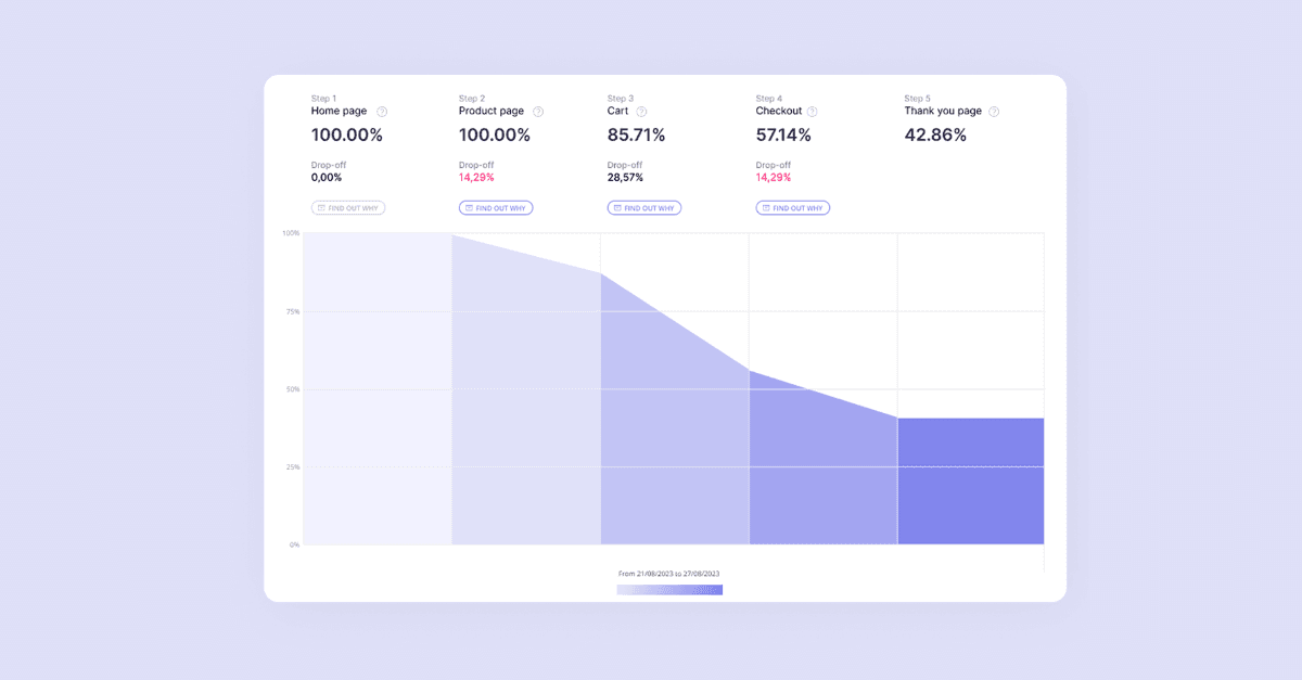
For the new bundle-building flow, the path might look like this:
- Step 1: Land on a product page
- Step 2: Click into the "Build Your Own Bundle" tool
- Step 3: Add a bundle to the cart
- Step 4: Reach the checkout
At first glance, things seem to be working. Plenty of users click into the bundle builder after browsing a product. Then comes the cliff.
The drop: Exit behavior flags a block in the customer journey
That means 4 out of 5 users who enter the tool abandon the site entirely before adding anything to the cart. Not just a bounce - an exit. And not just anywhere. They’re leaving at the exact moment they were supposed to get more engaged.
That’s not a stumble that’s killing conversions.
At this point, the problem is a UX red flag. Users are entering the tool with clear intent, but something on that page is confusing, frustrating, or off-putting enough to make them quit altogether.
Now it’s time to dig into how they’re interacting - clicks, scrolls, rage clicks, cursor freezes. That’s where the real answers live.
How user behavior analysis reveals the real reason behind the drop
We know that 80% of users who land on the "Build Your Own Bundle" page leave the website. What’s missing is the why. Traditional analytics tells you how many people drop off, but not what’s stopping them from moving forward. To get answers, you need to rely on user behavior analysis. That means seeing exactly how people interact with the page.
CUX is a Digital Experience Analytics platform that helps you do just that. It automatically detects frustration signals and ties them to specific business goals. For example, consider this:
- Are users starting the bundle process but failing to add items to the cart?
- Are they reaching the form but not submitting it?
- Are they viewing product options but never moving to checkout?
CUX connects these behaviors to your defined goals, like submitting the form, or reaching the payment page, and highlights exactly where the user journey breaks down. You don’t have to sift through every recording or heatmap. You see the patterns that block conversions, so you can fix the right problems and recover lost revenue faster. But what exactly are visit recordings and heatmaps,and how do they reveal friction? Let’s break them down.
Visit recordings - Observing the struggle
One of the most powerful ways to understand what’s confusing users is through CUX’s Visit Recordings.
What they are: A Visit Recording is a video-like playback of a user’s session. You can watch every mouse movement, click, scroll, and page transition. CUX flags visits where users show signs of struggle (like rage clicks or erratic movement), so you know which recordings to check first. Each visit adds another layer of insight, building a clear picture from actual behavior data rather than assumptions. Instead of guessing, you can see website visitors struggle in real time - a level of user behavior analysis that dashboards alone can’t provide.
The behavior: A user adds two items to their bundle. A progress bar shows “2 of 3 items selected.” They move toward the “Add Bundle to Cart” button, but it’s greyed out. They click anyway. Then hover. Then scroll back to their selected items. Then return to the button. Their movements become scattered as they scroll the page up and down, looking for what to do next. After 90 seconds of this loop, they leave the site.
Heatmaps - Visualizing behavior data
The recordings give us a strong starting point. To see how widespread the issue is, we turn to CUX’s Heatmaps.
What they are: A heatmap is a visual report that shows where people click. Warmer colors like red and yellow signal heavy interaction. Cooler colors like blue and green show areas with little or no engagement. We generate a click heatmap for the bundle page, based on thousands of visits and real user behavior metrics. The result speaks for itself.
The behavior: A bright red hotspot sits right on top of the disabled “Add Bundle to Cart” button. It confirms what we saw in the recordings: users are repeatedly clicking a button that isn’t working the way they expect. This is a classic sign of frustration. Just beside it, a small “i” icon next to the progress bar, containing the explanation that three items are required, is pale blue. Almost no one is clicking it. The instructions are there, but they might as well be invisible.
Thanks to CUX, we know where the problem lies: Users don’t understand that the bundle needs three items. When they try to check out and the button won’t work, they get stuck. Their only response is to click harder, look around, and eventually give up.
We’ve seen the breakdown happen, and we have the numbers to prove it. We’ve found the root of the problem.

The simple fix that increases conversion rate
With clear evidence of user frustration, the problem comes into focus. Moreover, we have a proof that the strategy holds up and the feature actually makes sense. What’s missing is a clear message. Users are ready to buy but left unsure about the next step, and the page stays silent.
Once you’ve seen how users behave on the page, the solution practically writes itself. The fastest way to recover lost conversions is to close the communication gap.
The good news is that no complex redesign is needed. Just a small adjustment that turns user hesitation into action.
What changes: Your team updates the button logic. When someone selects two items, the greyed-out “Add Bundle to Cart” button is replaced with a message: “Add 1 more item to unlock bundle.” As soon as a third item is added, the button turns green and updates to “Add Bundle to Cart.”
The message does exactly what the old version didn’t. It explains the rule, supports the user’s intent, and makes the next move clear.
The impact: From confusion to conversion
Once the change goes live, the results follow quickly.
Expected possible behavior shifts:
- Exit rates on the bundle page drop from 80% to around 15%
- Rage clicks disappear from the interface
- Conversion rates recover and rise by another 6%
- Average Order Value increases by 25%, finally delivering on the original goal
A small change brings a feature back to life, and turns a risky quarter into a strong one. With the right insights, revenue that once felt lost becomes achievable again.
Why continuous conversion optimization wins long-term
You saw the numbers dip and felt that familiar sense of urgency. This time, you caught the problem early enough to act. But what about the issues that don't announce themselves - the silent problems that slowly erode your metrics?
Staying ahead of these silent problems is the core idea behind continuous analytics, the approach CUX is built for. By automatically tracking and visualizing user behavior, CUX helps you catch the earliest signs of friction before they snowball.
This shifts your entire approach. Instead of reacting to a crisis, you're proactively optimizing based on real-time insights. You’re saving deals, but also building a better experience that prevents revenue loss in the first place.
The takeaway: Understanding user behavior helps you recover lost revenue
This bundle feature didn’t fail because of poor design or lack of demand. It failed because no one was watching closely enough. When you track user behavior in context, issues like this don’t slip through the cracks.
If you're seeing similar signals, let's talk.
Book a session with our team and turn silent exits into measurable growth.