October 29, 2025
6 min read
30% of users click where nothing happens — and your customer journey shows why
If you monitor customer behavior in your e-commerce store, you've probably heard of heatmaps – graphical representations of user activity.

Kamila Kotowska
Head of Growth at cux.io

These “misclicks” reveal gaps in your customer journey mapping — places where intent is high but UX doesn’t respond. With the right behavioral analytics tools, you see where buying signals get wasted and how to turn them into conversions.
E-commerce store customers rarely behave predictably. This is particularly evident when performing behavioral analysis. Designed paths turn out to be the least frequented, while side routes to conversion are the most crowded. However, to understand why users don't behave in the way we planned, we need to gain basic analytical knowledge. So let's start with the differences between heatmaps and link maps.
Understanding clicks heatmaps vs link maps
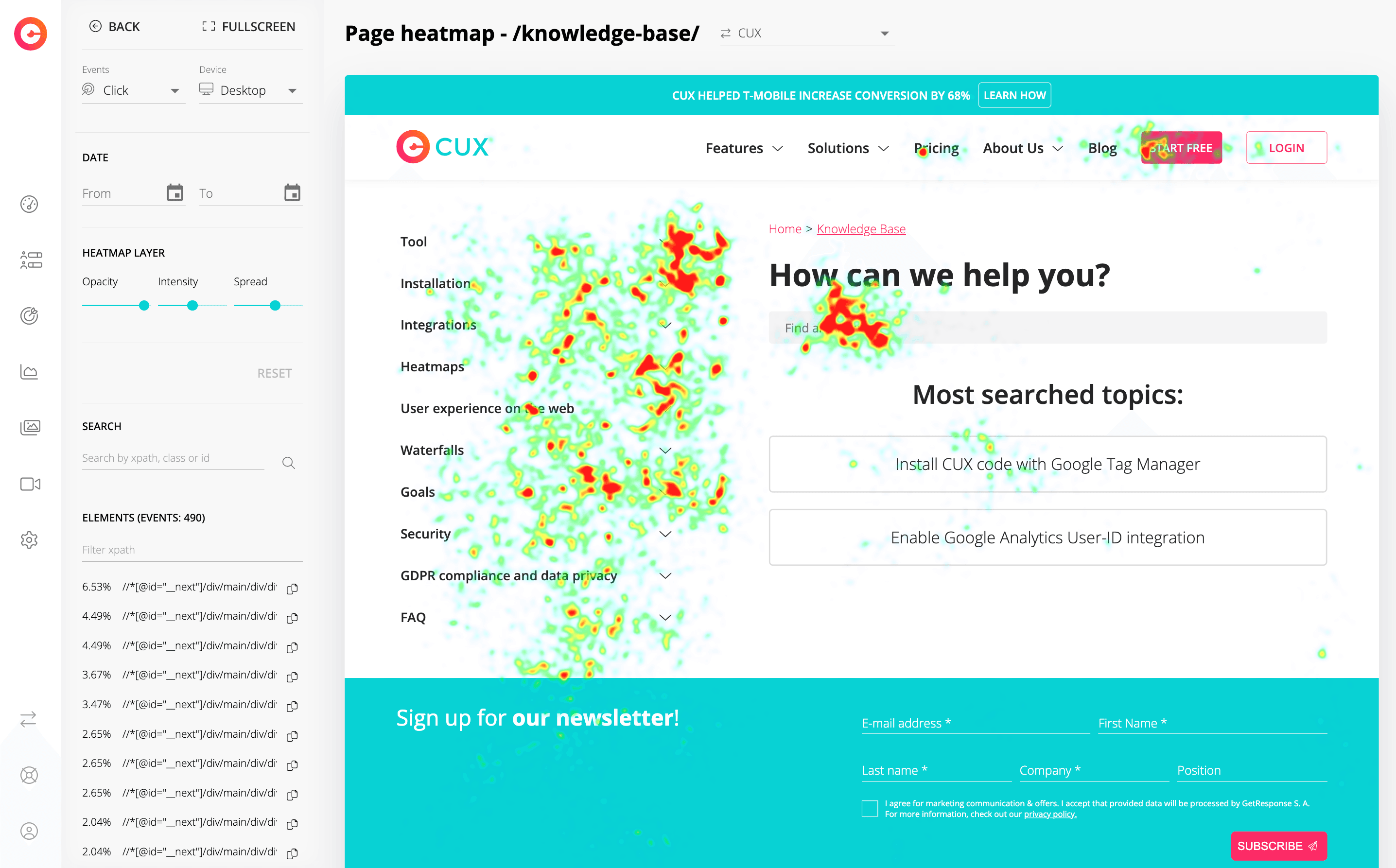
Heatmaps are visual representations of the areas with the highest activity of visitors on a given webpage. They include ALL activities. Therefore, you will notice mouse movements, clicks, rage clicks, and even content zooming (on mobile devices).
Each recorded activity makes the area "hotter". Places where users click most often are marked as hot regions (with red being the hottest color). Places where users click less frequently are marked as cold (blue and green). Areas without colors indicate where there is no user action.
So, what can you observe on heatmaps? When you combine heatmaps with user behavior analysis (UBA) and behavioral segmentation, you also see how every moment of the customer journey affects decisions — not just clicks.
Link maps, although very similar to heatmaps, work in a slightly different way. Above all, they only show interactions that occur on the page in places relating to links. Therefore, you will ONLY see clicks on so-called clickable elements such as links, CTA buttons/form fills, hyperlinked images, etc.
Why are link maps worth-using? It is a very straightforward and intuitive feature to:
- track user activity,
- see which links visitors click or tap (on mobile),
- identify ineffective links, calls to action (CTAs) and images that are ignored,
- identify clickable content that is most popular or generates the most traffic. Find out more about the differences between Heatmaps and Link Maps in our case study.
_
The link map shows which linking elements are clicked and to what extentThat’s why link maps are essential in conversion rate optimization (CRO) — helping you catch UX friction in user flows, confusing navigation and CTAs that fail to stand out.
Important! When looking for a behavioral analysis tool, pay attention to how data is collected and presented on heatmaps. Many analytical tools call a visual representation of clickable elements a heatmap, when in reality it is just an image of interaction with clickable elements!
_Why aren't users clicking?
You surely have elements on your website with which interactions are more important to you than other parts of the store. These are probably individual fields in contact forms, CTA buttons, links to the most popular product categories, and so on. However, it may happen that user activity maps (both heatmaps and linkmaps) will be completely empty in these places. Customers are not clicking.
What to do in this situation?
- Check if links are not broken (e.g. typo in the link).
- Check if the elements you are examining are linked at all.
- Display maps in different device views – maybe the link doesn’t work or is not visible on some devices.
- Check clicks on different browsers (with particular attention to default mobile browsers).
When key actions remain unnoticed or unreachable, both your conversion rate and customer acquisition cost (CAC) are impacted. Every ignored CTA is a wasted signal of buying intent.
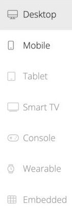
In CUX, you can display heatmaps/link maps for many types of devices, such as tablets, consoles, or even wearables (like Smart Watches).
By working simultaneously with heat maps and link maps, you have the means to quickly identify missed opportunities for conversions. Combined insights will allow you to find non-clickable areas that generate clicks or track broken links. You will also receive optimization tips such as the need to check if the link is anchored in the right place or identifying places that should be clickable but are not.
Why do users click on non-clickable elements?
Have you ever observed user activity on the heatmap that does not match clicks on the link map? Bingo! You have just found areas on your website that require optimization.
Users clicking on non-clickable elements, such as "bare" text, images without hyperlinks, contact information without links, etc., give you a clear message that the conversion is slipping through your fingers!
These micro-interactions are a powerful part of customer experience analytics. Paired with predictive analytics, they help you spot friction before conversions drop — instead of after.
What insights are gained from observing user interactions with non-clickable elements in an e-commerce store? Perhaps the title of an article on your blog looks like a call to action (CTA), and therefore should be a clickable button. Maybe moving to the next page should start with clicking on an image rather than just hovering over the arrow. Perhaps the email to your Customer Support department should include a clickable "mailto:" command.
Real Examples from E-commerce
- Users try to click delivery icons expecting info pop-ups
- Shoppers tap photos instead of tiny “Add to Cart” buttons
- Mobile users click address text expecting a one-tap call
- Visitors click promo banners that look like CTAs
Each of these is a lost step in the retail customer journey — and a reason why user tracking must go beyond simple analytics.
Important! Keep in mind that heat maps are static images (screenshots of your website). So, if you observe "flying" clicks, for example, around the menu bar, consider whether it might be just an interaction with a hoverable dropdown menu.
Comparing the results of heatmaps and link maps is a real treat for optimization enthusiasts. The small suggestions that result from customer behavior and their interaction with your e-commerce site are a treasure trove of knowledge that allows you to constantly increase conversions. Next time you analyze user behavior, pay particular attention to the type of interaction with links - perhaps you are sitting on a ticking time bomb that has the potential to launch your business to the next level! 😉
Visual methods that track website analytics — including session replays and journey orchestration dashboards — help you truly see website visitors as they experience your store, and increase conversions step by step.