August 25, 2025
9 min read
How to increase user engagement on the first page of the website?
The first page of your website is hands down the most important touchpoint in ensuring high customer engagement. It’s like a storefront window.

Unfortunately, many businesses still haven't fully harnessed the potential that comes with optimizing the first page of your website to the T. Thankfully, you are not like those guys and know just how important the first impression is in increasing user engagement and driving conversions. Now, get comfortable and keep reading to learn how to make the first page of your website absolutely insatiable to your users.
What does user engagement mean?
User engagement is a relatively broad term, but it boils down to whether your users find your page valuable, engaging, and relevant. User engagement metrics are expressed by different on-page activities, such as clicks, scrolls, shares, downloads, and dwell time.
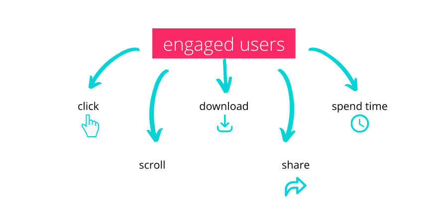
Engaged users will actively explore your page. Disengaged users, who did not find anything worthy of attention, will quickly leave your page – this event is expressed by your website's bounce rate.
Taking steps to increase user engagement is directly related to improving profitability and is crucial for your business's growth. Only engaged users are the ones who start a free trial, buy, and promote your brand.
Now that you have succeeded in driving traffic to your page, it's time to learn how to increase user engagement and keep your customers on the conversion path.
Why you need to increase user engagement on the first page?
To win the digital game you have to give your best in each and every aspect that increases user engagement, develops customer loyalty toward your brand, and keeps your visitors on the site. Making a good first impression is key.
Website visitors have grown very picky with what they consider to be good enough for a webpage. Being able to provide an impeccable user experience has become a qualifier when it comes to even becoming competitive in the market. Either be on top of your game or watch your bounce rate go up, and your potential customers run to your competitors.
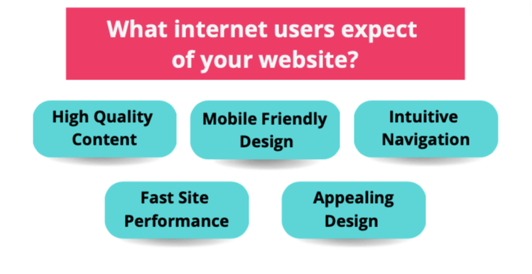
Why you are failing at website user engagement
Believe it or not, it has been over 31 years since the very first website was deployed - Tim Berners-Lee launched the world's first website, the World Wide Web, on August the 6th 1991. This is what it looked like.
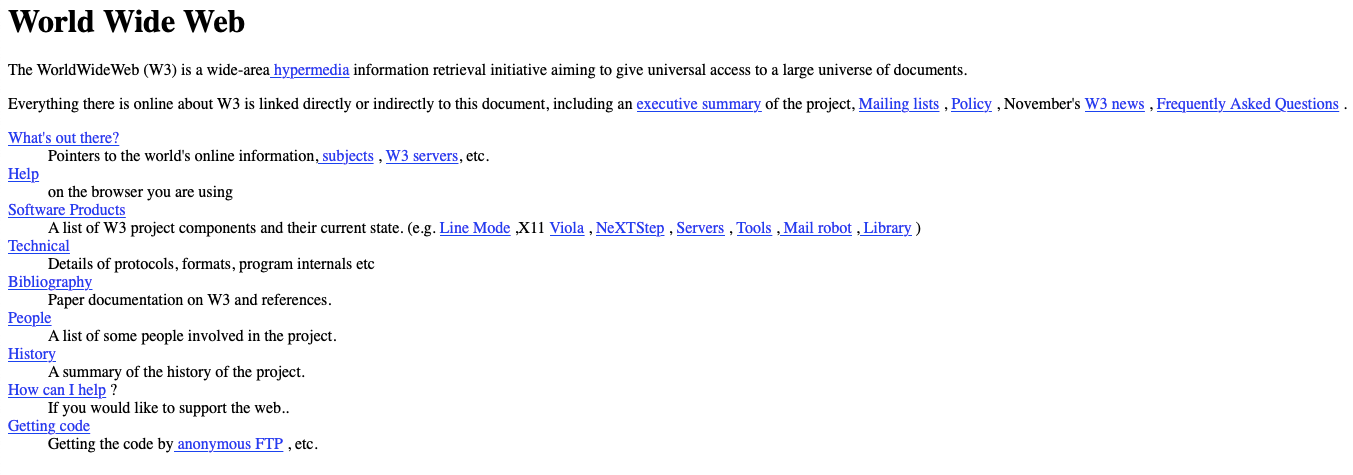
For today's standards, it looks more like an error page, than an actual, functional website. It's safe to say that most users nowadays would not waste as much as 5 seconds on it, because it does not indicate a positive customer experience. It was, however, an enormous breakthrough of its time, and paved the way for the incredible websites we engage with now.
This is of course an extreme example, and we would never assume that your first page looks anything like it. But should your first page evoke feelings of distrust, unprofessionalism, or confusion in any way, the customers will simply leave.
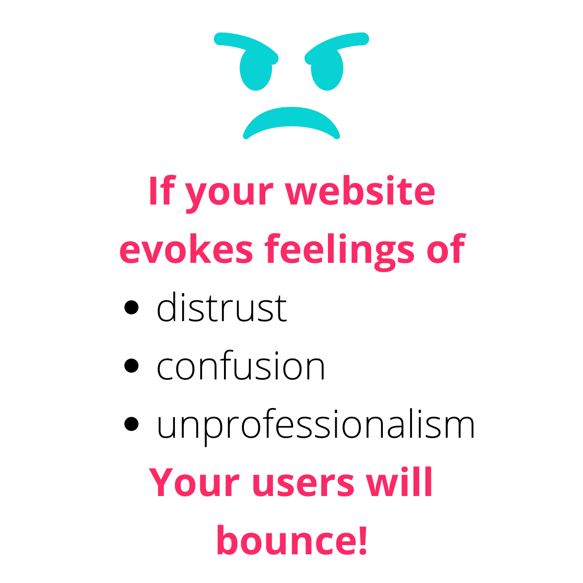
Even the most visually stunning websites can encounter this issue. Remember, looks are not everything, it's the UX that counts.
Engaged users are a direct result of a well-designed and optimized page. Making your page readable, accessible, and easy to navigate will help users interact with it confidently, drastically improving your website engagement.
Most common mistakes that hinder your efforts to increase user engagement
When trying to improve user engagement, you may find yourself accidentally making the user experience on your website worse than before. Let's have a look at the most common mistakes made when trying to improve user engagement.
Too many messages
More messages do not equal more user engagement. Although staying top-of-mind is an important factor in user engagement, bombarding your customers with messages is likely to have the opposite effect.
Instead of suffocating your customers with emails, on page pop-ups and social media notifications, focus on creating and distributing messaging that's more impactful. This will yield better results than relying on the frequency and quantity of messages you send to your users.
Inefficient use of microcopy
Microcopy is a vital element of developing an effective user experience. Microcopy is essentially what helps guide your users through your website. Microcopy is the 'welcome' message after the users log in, or the 'error' message when something goes wrong.

Not using microcopy will confuse your users, or at the very least make them feel unsure of their actions on your website. Making certain that users feel confident and well-informed when engaging with your website is an important element of ensuring high customer engagement and a positive customer experience as a whole.
Not personalizing your website
With the extensive ability to collect and analyze your customers' data, not making an attempt to provide users with personalized experiences is a significant miss. Of course, it will take going the extra mile, but are the long-term results not worth a bit more effort on your part?
You can quickly increase user engagement by adding a sprinkle of personal touch. You can, for example, personalize the home page, provide personalized product suggestions or even include your customers' names in their abandoned cart email.
Being too creative and not considerate enough
We mentioned that it's important for modern businesses to invest in high-quality website design. While that is true, some tend to take it to the extreme, focusing too much on the creative side of building a website, and not enough on asking themselves whether users will find it appealing and functional.
The quality of your customer experience will be dictated by how your website is perceived by your customers, not you or your creative team. While it's important to make sure your website is visually appealing, don't overdo it just for the sake of having the most creative website design out there. If your customers respond best to the simplistic website design, that is the way to go.
Increasing user engagement strategy starts with effective analytics
Figuring out what makes your users tick is no walk in the park, never was and never will be. If you want to figure out what your customers think about the first page of your website the traditional way, you may be in for a nasty bit of work. The old-school way of analyzing optimization opportunities for a website's UX involves tons of A/B testing, focus groups, interviews, etc. Before you get to the bottom of how you can improve customer engagement on your first page, it will already be too little too late. Users came, saw, and didn't like it.
And to add insult to injury, your competitors are now profiting from your efforts.
While those techniques may have been good back in the day, they are a thing of the past when compared to the UX optimization tools available today.
Tools like Google Analytics are widely recognized as useful for analyzing quantitative data about one's website visitors. But they do not always provide you with all data that are relevant for increasing user engagement. If you want to obtain a full picture of your users’ behavior, and spot their pain points, frustrations, and opportunities for quick wins, your best bet is to opt for a high-performing alternative – cux.io.
How to use CUX to analyze a website’s engagement
CUX is the only UX and Analytics Automation tool available on the market. What makes it so special, and how does it help you increase user engagement?
Record user visits
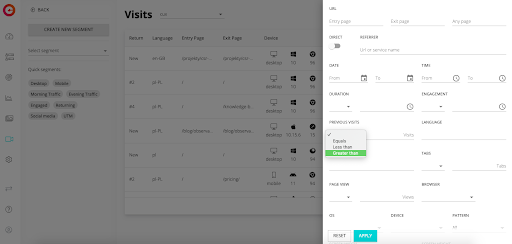
Visit recordings allow you to see how users engage with your page. You can observe where your customers clicked, how far they scrolled, how they moved the cursor. This is especially useful when you want to know how willing your users are to explore the first page. If they scroll down or move the cursor along different elements of the page, you are on a good track.
However, if they don't bother scrolling down your page by even a millimeter, you are in deep trouble. This means the user becomes disengaged as soon as they enter your page. It's a hard pill to swallow, but realizing your shortcomings is the first step to increase user engagement on your site and decrease your bounce rate.
Spot user pain points and frustrations
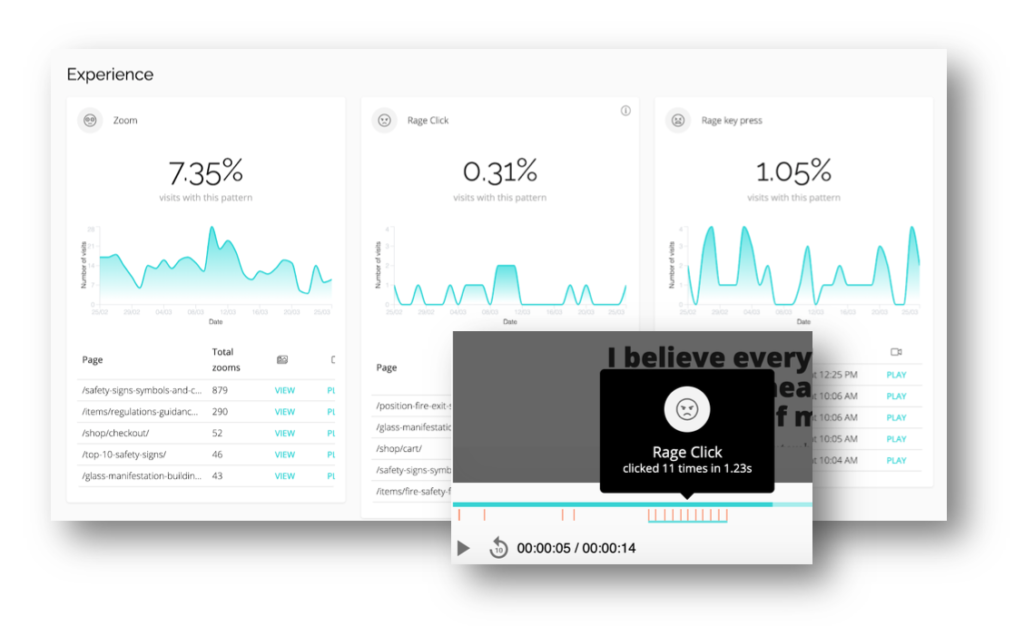
Happy users = engaged users. If your customers come across one too many obstacles, they will not bother moving any further in their buyer journey with you. Customers want a seamless online experience. Now with CUX's help, you can quickly spot the exact moments when your users become frustrated, and eliminate them.
With CUX's Experience Metrics, you can recognize, detect and define the behavioral patterns of your users.
Zooming, rage clicks, rage key presses, chaotic movements, and page refreshing, are all indicators of your users' struggle with engaging with your page. You will always know if something bad is happening on your site and if the customers have any difficulties with it. To increase user engagement, you need to bring these behaviors to a minimum.
Worrying about your bounce rate raising will become a long forgotten issue, once you improve your on-site customer experience by getting rid of every single user pain-point.
Start increasing your user engagement today {start-increasing-your-user-engagement-today}
To finish this article off on a great note, you can make use of all of CUX's features that help improve user engagement on the first page with the free trial of the tool. Just sign up, implement the code and enable integrations. CUX is extremely easy to operate even if you have no analytical experience. If you would like to be given a grand tour of the tool, CUX's team is more than happy to help.
