February 28, 2023
7 min read
Heatmaps on mobile devices and practical ways you can use them
“Mirror, mirror on the wall, tell me why my conversion rate doesn’t grow on mobile devices?” If only there were a mirror like this, the conversion rate optimization process would be much easier.

Aleksandra Pyza
Content Marketing Specialist at cux.io

But hey! What if I tell you that there is something way more lucrative? A heatmap that tells you how users engage across your web page or mobile app screen.
As you read this article, you'll learn what are mobile heatmaps and what is the difference between them and mobile app heatmaps, also known as heatmaps. How does web and mobile product heatmap work, and how to read it correctly. Lastly, what fruits can you harvest from heatmap tools?
Let’s dive into this mobile and web heatmaps ocean.
What is a mobile heatmap?
A mobile heatmap is a visual representation of users’ most significant interaction on site. Mobile heatmaps are one of the most social analytics for the human eye to identify a large amount of data.
Through different sizes and colors, heatmaps visually present smartphone users' level of engagement like clicks, mouse moves or depth of scrolls.
A heatmap can be associated with a thermographic camera. Red colors (warm) point out areas with the highest user engagement, whereas green color (cold) represents areas that indicate cool concentration. Also, between red and green color, there is a range of colors showing average engagement.
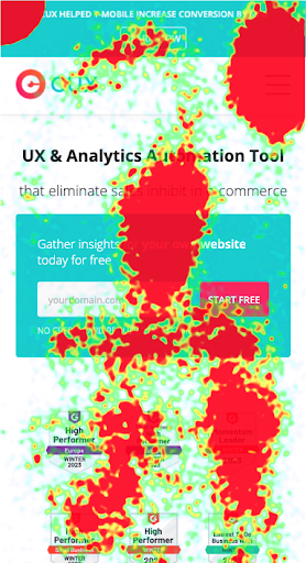
Some of heatmap tools offer even deeper analysis of how users interact and present a list of users' gestures and micro interactions like swipe up, swipe down, double taps, rage taps, or single click, etc.
Mobile heatmap vs. mobile app heatmaps.
Those are 2 different kinds of heatmaps. Unfortunately, a lot of marketers confuse them.
Websites use HTML code as a baseline, then the captured usage data generates heatmaps. For mobile apps this process is way complex, because of the development platform and operating system.
If you look for a heatmap mobile app tool you should search for a dedicated one. It will enable you to analyze app users behavior, app usability and interface.
How do mobile heatmaps work?
Heatmaps are generated based on captured usage data mobile. They aggregate interaction data to develop a graphic overlay of a single screen from the website, which can be used for:
- finding usability issues,
- analyzing user behavior,
- discovering user frustration and pain points,
- debugging mobile websites,
- optimizing conversions,
- understanding if users are getting the right user experience.
Heatmaps are a great source of information in user interactions, but to draw conclusions from mobile heatmaps you need to know how to read them.
How to read a mobile heatmap?
Heatmaps can bring a lot to the table but also can bring some trouble. That’s why you should make your hypotheses carefully, even if you have “the best heatmap tool”.
When you look at a heatmap, don’t take everything for granted
By default, heatmaps show gathered data on where users navigate. It’s a summary view of users' actions through different device sizes – desktop, mobile, tablets, and smartwatches.
Specific devices have different resolutions. Most heatmap tools do not cheap out and generate heatmap for each screen resolution or type of iPhone. They generalize the picture by showing the most common screen size for a specific screen resolution.
Heatmaps for sure haven’t heard about .
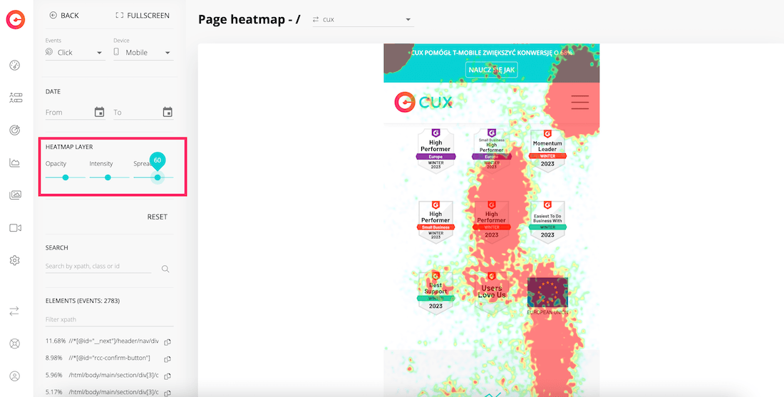
Heatmaps don’t show dynamic elements like the drop-down menu bar, cookies bar or pop-ups. It’s a static snapshot of the default state of a specific page. That’s why on visual overlay you can see floating stains.
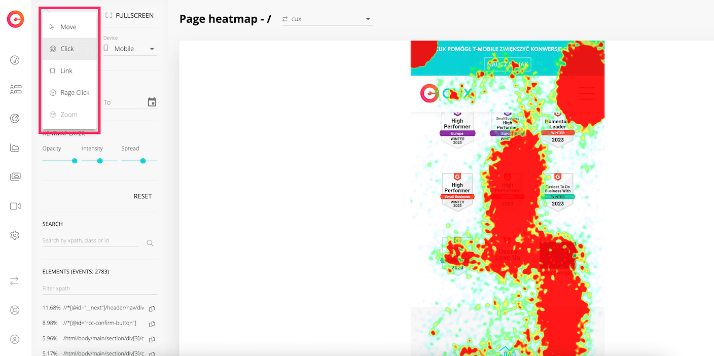
To avoid reading the tea leaves, CUX generates the list of the top interactive elements. You can check what your users tap even if it is a dynamic element. The list can be filtered by XPath of a chosen element.
Clicking is not always a good indicator
If your overlay shows big colorful stains it means users tap, but don't automatically assume that they enjoy it. Those might be rage taps. In a short period of time, users intuitively tap one element several times without receiving any response from the smartphone.
If you want to get the lowdown on how to read the heatmap check out Kamila’s articles. Once you've read them, you'll have a different point of view about mobile heatmaps.
How to read Heatmap. Part 1 How to read Heatmap. Part 2
Mobile heatmaps are a must-have for profitable business
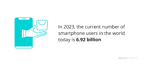
Almost 86% of the population owns a cell phone. The current number of mobile phone users around the globe is 6.92 billion.
Right now people rather purchase from desktops than mobile devices, but they go through the first 3 stages of the sales funnel (Awareness, Interest, Desire) through their mobile screens.
You can feel overwhelmed by the number of new technologies, especially now when you have to think not only about desktop but mobile too but let’s crouch over it.
From which business would customers rather buy goods? The one with a good mobile app interface or the one that gives them the creeps from mobile app usability?
Obviously, users would choose the first one.
Mobile and website navigation are very different from each other. You shouldn't assume when something works on a desktop it would also work on a mobile. Keep an eye on mobile analytics but also on all of the other resolutions that your users use. Below you will find a list of 3 main benefits that you can gain from using this essential tool.
To increase conversions
Heatmap analysis is a great way to decrease the number of problems that your users are facing. For example, you won't get a high conversion rate if your call-to-action (CTA) has a broken link or doesn’t contain it all (dead links).
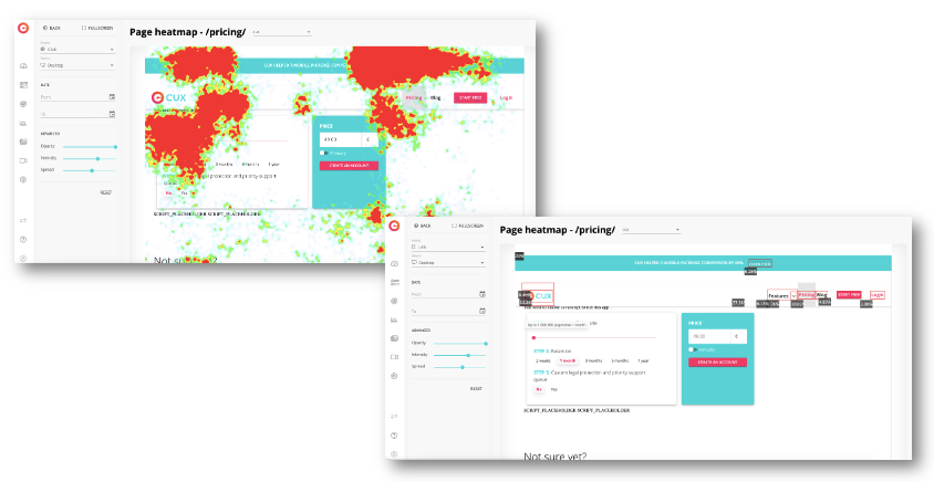
CUX fends you from such a missed opportunity. By having mobile heatmaps and linkmaps and comparing one to the other you’ll be able to find non-tappable elements that your customer may tap.
Read those little colorful stains correctly, because they can point you to missed opportunities to have links (dead links).
To improve user experience (UX)
Keep in mind that a poor user experience often comes together with a low conversion rate. It's not the result of an error in the check-out process itself, but the overall customers’ experience that they fell at previous stages of a market leader.
You can decrease user frustration by filtering your mobile heatmaps through experience metrics. You can determine which elements in your app annoy your users, and what are the reasons your users leave.
Select a specific heatmap and filter it by a certain event like a rage click or refreshing. Look for elements that contain one of these behavioral patterns. You can easily increase customer motivation, improve their experience, and ultimately increase sales without large and resource-consuming changes.
To predict your user behavior
Just like a fortune-teller can predict your future from cards, CUX mobile heatmaps can analyze user behavior through their gestures.
For example, if a colorful stain is generated on a block of text, that doesn’t contain a link. It means your users are highlighting it.
What is great about CUX mobile heatmaps is the fact that you don't have to take screenshots of each screen for CUX to get a visual context for what your mobile app heatmap shows.
The intensity can be increased to see exact click points, the spread can be adjusted to focus on single areas, or the opacity can be altered to have a better view.
Wrapping up
Whether you analyze products, websites or mobile apps, heatmaps are always first to come to the rescue. They provide a primary overview of the usual user’s behavior.
That’s why heatmaps are a good starting point for every business to get actionable insights.
Seeing which elements are engaging and which aren't will help you improve your user experience and interface, which will lead to higher conversion rates.
But don’t be dazed by all those colorful stains. You should keep in mind that heatmaps, even the ones for mobile apps also have some serious limitations.