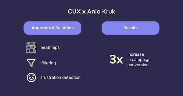
3x increase in campaign conversion – Ania Kruk Case Study
In a quest to refine their campaigns strategy, Aniakruk.pl, a renowned Polish jewelry brand, joined forces with CUX. Their aim? To unlock insights that would spark immediate campaign improvements and shape future initiatives.
3x
conversion increase

Challenge
Ania Kruk wanted to better understand how users interacted with seasonal campaign pages, especially during the critical Valentine’s Day period. Although the campaign generated traffic, it wasn’t clear whether users were finding the right products or getting lost along the way.
Goals
- Improve performance of ongoing campaigns
Aniakruk.pl aimed to optimize engagement, conversions, and customer satisfaction in active marketing campaigns, especially seasonal ones like Valentine’s Day, by analyzing how users interact with promotional content and product listings.</br? - Use behavioral insights to shape future strategy The goal was to better understand user preferences and behaviors in order to inform upcoming campaign planning. This included identifying friction points and missed opportunities that could be improved through more tailored targeting or website adjustments.
Our approach
Analyzing general campaign page behavior
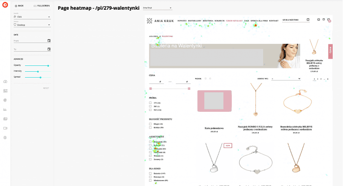
In the case of aniakruk.pl, right after Valentine’s Day, we started the analysis by checking how customers generally behaved on the page with products specially selected for the occasion. We used heatmaps for direct entries and for visits navigating within the Valentine’s Day offer.
Filtering heatmaps to isolate campaign-specific traffic
By analyzing the clicks on the heatmap, we did not notice any unusual or questionable events. We’ve observed a rather natural, diffused flow of customers, without too much involvement in browsing individual products. Most of the clicks accumulated around the option to choose a specific assortment (on the left).
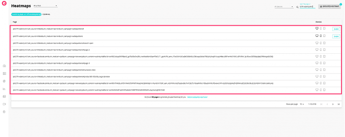
Creating grouped heatmaps for campaign traffic
Following our initial analysis, we've chosen to examine how identical entries appeared when accessed by customers who had clearly reached our website through external campaigns. To do this, we simply filtered the entries based on the provided URL.
It's important to note that the web address used in the campaign should include an additional 'tail' to identify where a given user came from e.g. fbclid.
We've utilized filtering to compile a list of all the addresses that are of interest to us. Following that, we've generated a grouped heatmap specifically for these addresses (you can find this function in the upper right corner of the app). This type of heatmap allows us to create a collective representation for multiple URLs, particularly for those URLs containing pages with similar structures, such as product pages or campaign landing pages. In the initial analysis, these addresses might only be visible as individual URLs.
Understanding user intent through interaction density
In this scenario, the situation differed somewhat from the case of direct entries. Firstly, we noticed a significantly higher user engagement with more frequent clicks (indicated by more red spots). Additionally, the grouped heatmap revealed that customers showed greater enthusiasm for interacting with filtering options rather than clicking directly on the products themselves. They made various attempts to refine their product selection - they were trying all possible ways to narrow down the range of products! Notably, the item in the top menu labeled 'Czego szukasz' ['What are you looking for'] was also particularly popular.
Searching for frustration signals
Interestingly, we did not see an increased or significant number of clicks in the menu after its expansion. Only a few clicks in the vicinity of the banner. Remember that a heatmap is only a visualization of a single page state. If customers expanded the menu, then in the classic heatmap we will observe clicks “floating in the air”. When in fact they may relate to elements such as pop-ups, widgets or just a sliding menu. From the analysis of the grouped heatmap, we can conclude that customers did not move further on the site. This may suggest that they did not find what they were looking for. A conclusion that is especially emphasized if we go deeper into the analysis.
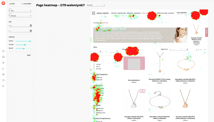
Rage click analysis confirmed pain points
Changing the data display type to “rage clicks” only confirms our hypothesis. Customers were disappointed after clicking on the aforementioned category. In addition, it gave us valuable information about existing problems. Including the info about usefulness of a slider that allows filtering by prices. What's intriguing is that we caught a glimpse of customer hesitations - it was as if they were standing at a crossroads, unsure about the best way to have the products presented before them.
Impact
Conversion rates increased threefold
This approach unlocked a remarkable outcome - threefold increase in conversion rates. This success wasn't a stroke of luck; it was the result of deliberate decision-making grounded in user behavior insights.
Filtering behavior shaped future campaign strategy
Customers leaned towards refining their e-commerce experience by narrowing down their search results. This inclination becomes evident through their interactions on the website - behaviors like gravitating towards filtering options, engaging with the "What are you looking for" menu bar, and expressing frustration through "rage clicks" around the price-adjustment slider.
Recommendations included campaign segmentation and filter redesign
Considering these insights, we've crafted a recommendation for an upcoming campaign: strategically center it around segmented offerings, such as products within designated price ranges. Furthermore, we also recommended further investigating the usability problems of the price slider. Working out a new solution for it could significantly improve conversion.