December 4, 2025
5 min read
Know your user’s mind: Valentine’s campaign analysis for jewelery brand [FREE UX CASE STUDIES E-BOOK]
When trying to improve campaigns, we use trends and research of customer preferences, as well as “proven methods” from the market’s specialist.

Kamila Kotowska
Head of Growth at cux.io

By analyzing specific customer journey data from a Valentine's campaign, we uncovered how user behavior analysis (like spotting rage clicks) can pinpoint missed conversion opportunities and guide smarter campaign orchestration.
Valentine’s jewelry brand campaign
For aniakruk.pl, one of the Polish jewelry brands, we conducted a quick analysis of the Valentine’s Day campaign. Quick, because all we had to do was to compare the whole Valentine’s Day traffic to the traffic form campaign itself. It helped us perform deeper user behavior analysis to understand exactly what customers were doing on the site." It also guided us on how to design new campaigns that will better suit users needs in the future.
But let’s start from the beginning. CUX automatically collects and generates heatmaps for all URLs that the user has accessed at least once. Thanks to this, we can analyze customer journey data at any time. We do not have to plan in advance what address we will research and at what time we’ll do it. This allows – especially in a problematic – to use analytics to better understand any occurring event.
In the case of aniakruk.pl, right after Valentine’s Day, we started the analysis by checking how customers generally behaved on the page with products specially selected for the occasion. We used heatmaps for “direct” entries and for visits navigating within the Valentine’s Day offer.
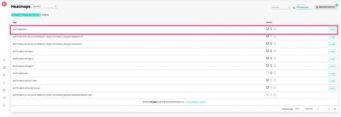
The heatmap applies only to entries on a specific URL
By analyzing the clicks on the heatmap, we did not notice any unusual or questionable events. We’ve observed a rather natural, diffused flow of customers, without too much involvement in browsing individual products. Most of the clicks accumulate around the option to choose a specific assortment (on the left).
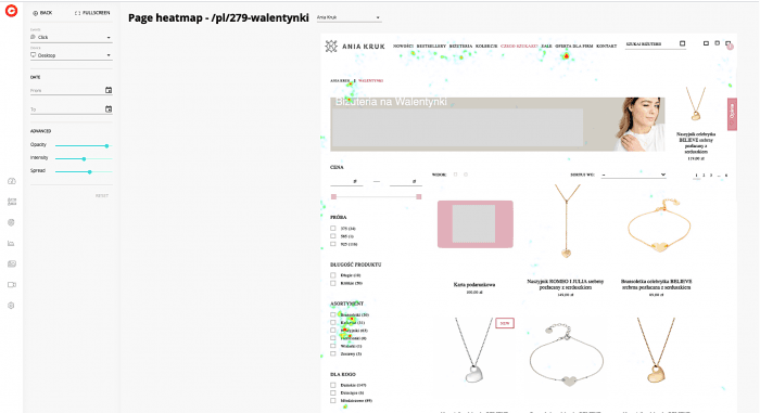
Heatmap for the aniakruk.pl Valentine’s campaign
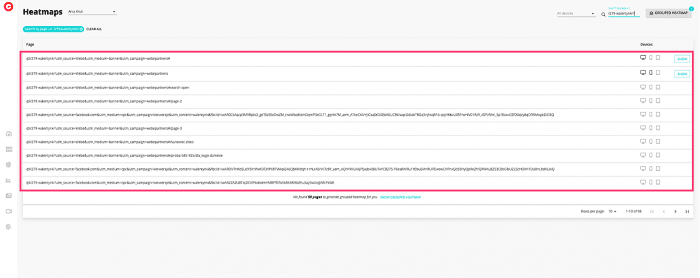
Filtering: Campaign only traffic
After the initial analysis, we used behavioral segmentation to check what the same entrances looked like for campaign traffic specifically. To do this, all you have to do is filter the entries after the given URL. The address should have an additional “tail” to recognize where a given client came from, e.g._ fbclid._
Using filtering, we have prepared a list of all addresses of interest to us. Then we’ve generated a grouped heatmap for them (the function is in the upper right corner of the page). Such a heatmap allows to generate a collective image for many URLs. URLs under which there are pages with the same structure – e.g. product pages or just campaign entrances. Those addresses, in the basic analysis, will be only visable in the form of separate URLs.
Grouped heatmap allows you to see the same page displayed by visitors using different entry points.
In this case, the situation is slightly different from the case of “direct” entries. First, we see a clearly greater involvement of users who clicked more often (more red spots). The grouped heatmap also allows us to observe that customers did not click on the products themselves as eagerly as on the filtering options. They were trying in all possible ways to narrow down the range of products! The item in the top menu under the name “Czego szukasz” [eng. What are you looking for] was also very popular.
Searching for frustration
Interestingly, we did not see an increased or significant number of clicks in the menu after its expansion. Only a few clicks in the vicinity of the banner. Remember that a heatmap is only a visualization of a single page state. If customers expanded the menu, then in the classic heatmap we will observe clicks “floating in the air”. When in fact they may relate to elements such as pop-ups, widgets or just a sliding menu. From the analysis of the grouped heatmap, we can conclude that customers did not move further on the site. This may suggest that they did not find what they were looking for. A conclusion that is especially emphasized if we go deeper into the analysis.
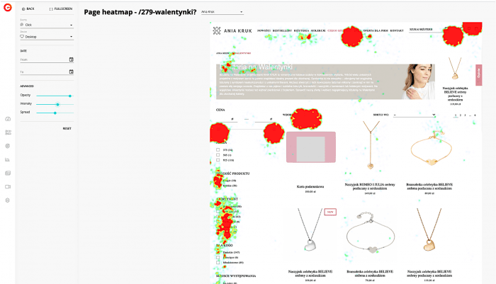
Grouped heatmap of the jewelry brand’s Valentine’s Day campaign
Changing the data display type to “rage clicks” only confirms our hypothesis. Customers were disappointed after clicking on the aforementioned category. In addition, it gave us valuable information about existing problems. Including the info about usefulness of a slider that allows filtering by prices. We could also observe the lack of decisiveness or difficulties of customers in choosing the way of displaying products.
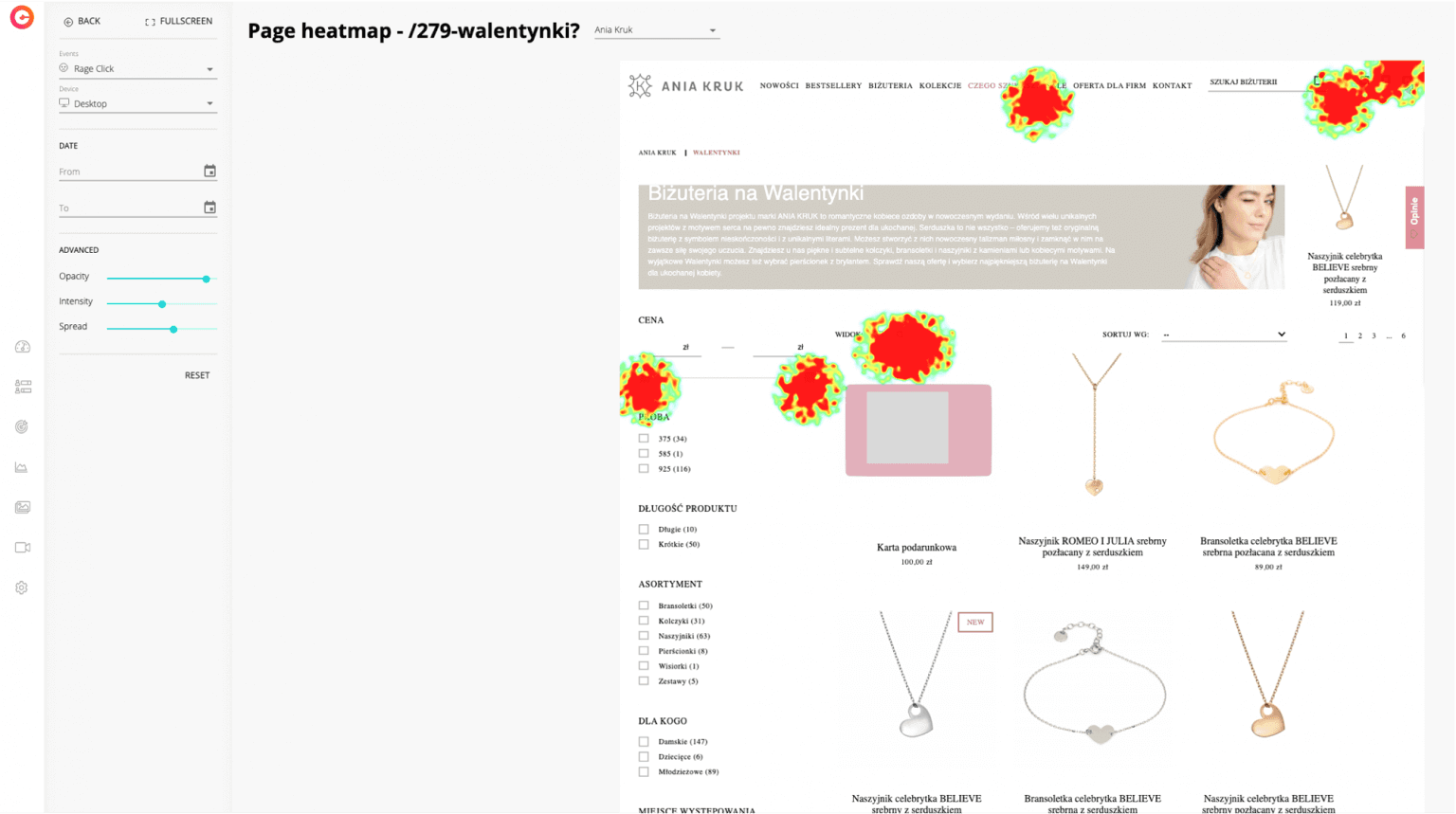
Grouped heatmap of the jewelry brand’s Valentine’s campaign focused on “rage clicks”
Conclusion
Contextual campaigns focused on individual product categories sell up to 3x more. Based on the above analytical case study, customers need to narrow down the results they get in e-commerce. It mainly shows in their behavior on the website. Things like moving mainly around the filtering options, clicking the “What are you looking for” menu bar or rage clicks around the price changing slider.
Our recommendation is to base the next campaign on segments, e.g. products in specific price ranges. In the meantime, we also recommend further investigating the usability problems of the price slider. Working out a new solution for it could significantly improve conversion.
Unlock the power to optimize user behavior, enhance your marketing strategy, and boost conversions like never before!