December 4, 2025
10 min read
Show me your website to uncover hidden user frustration
Your site is your business card. It’s place where your potential users will go after hearing an advertisement on the radio on a way back from work.

Kamil Walkowiak
Co-founder and CTO at cux.io

None of these ads will stop them for a longer time, after all, they are in the middle of an important activity. But that’s why when they do have a moment to go online, they will certainly soon appear on your website and stay here for longer (hopefully) to get acquainted with your product and – fingers crossed – to make that purchase.
A user-friendly website is free of common bugs like unreadable text or broken forms; use behavioral analytics tools to detect specific user frustration signals (like rage clicks) and optimize the user interface for better conversions.

The high cost of an unfriendly user interface
Does it load fast enough so that the client doesn’t run away impatiently? Does it have properly prepared content that will convince the customer to buy your product? Does it have graphics that will encourage him to click further? And most importantly – is the conversion path simple and intuitive enough to make him a happy owner of the product which looked so beautiful on a billboard?
If it’s the other way around, it may turn out that the user will run away from your website as soon as he appears. From his point of view there is nothing more annoying than a site that doesn’t work as he would like it to. A user-friendly website is crucial for retaining customers and encouraging conversions.

Why you must analyze your website beyond basic metrics
It goes without saying that a user-friendly website can be tracked, analyzed and fixed if something turns out not to work as it should. The tools for quantitative analysis (they will show you that something is happening – e.g. there is a drop in conversion) and qualitative analysis (they will show you why something is happening) are not new either. What is new, however, is what we have been working on for a long time in CUX.
Analyzing hundreds of recordings for many hours, going through shopping paths with our clients, looking for patterns of behavior, we came up with something completely innovative.
We created Experience Metrics to automatically identify points of user frustration, enabling deeper user behavior analysis. You will see indicators that inform you that something bad is happening on your site and customers are going through difficulties trying to deal with it.
Using Experience Metrics to uncover hidden frustration
To zoom in on how Experience Metrics works, let’s use the perspective of the “average internet user” and go through a list of the most common website bugs. Each bug will be assigned an Experience Metrics indicator and the level of frustration it can cause. To make these concepts easier to imagine, let’s use a real life scenario. Ready, steady, go!
5 common website bugs & the behavioral signals they trigger
1. Illegible graphics (Signal: Content Zooming)
EXPERIENCE METRICS INDICATOR: Content Zooming
FRUSTRATION LEVEL: Slight irritation
Content Zooming is a behavioral signal where users pinch-to-zoom on mobile devices, indicating that text or images are too small or illegible. Product images usually look nice on the desktop version, but when a customer wants to see them on mobile, it’s not so easy and enjoyable.
Imagine this – on your way from work you saw a billboard with the most amazing sneakers. Perfect for the upcoming summer, a must-have for this season, and there was a discount! This type of situation doesn’t happen too often so you’re psyched!
You’ve made the decision – when you get home you will go to the website with the intention to purchase. But, on your way back while looking through the photos on your phone, it turns out that you can’t see the weave of the fabric from which the shoelaces are made or the quality of the seams (and this is important, you don’t want the sole to fall off after two walks with Buddy). And that’s when the Content Zooming indicator appears – zooming in on graphics.
If the customer manages to do that, they might still complete the purchase. But it gets much worse if the picture refuses to cooperate (this may result in an additional indicator, Rage Clicks, but more about that later). Therefore, a good practice—which we have recommended to one of our clients—is to include at least one photo that shows your product in the biggest detail possible. So that the client can see what he wants to see right away.
2. Font & layout Issues (Signal: Refreshing)
EXPERIENCE METRICS INDICATOR: Refreshing
FRUSTRATION LEVEL: Aggravation
Refreshing is a frustration signal where users repeatedly reload a page, usually indicating slow load times, broken elements, or layout glitches.
So let’s go back to buying your sneakers. You saw them, you love them, you can already see yourself in them walking by the river at sunset, with some friends who can’t help but notice your awesome new kicks. But you still want to know the opinions of others who have already bought these. Let’s see. You click on opinions and guess what? While the page is loading, a part of the text is too big, a part is too small, you can’t read it. It’s starting to get on your nerves, but you decide to give the page one more chance.
Enter the second indicator – Refreshing, which is nothing else but reloading the page time and time again with short time intervals in between. This can happen several times, depending on whether the page will eventually load in the way that the client believes it should. Therefore, when building our website, we should remember to style the text properly, so that it looks correct at every resolution.
3. Confusing navigation (Signal: Chaotic Movement)
EXPERIENCE METRICS INDICATOR: Chaotic Movements
FRUSTRATION LEVEL: Irritation
Chaotic Movement is a pattern where the mouse cursor moves erratically without clicking, signaling that the user is lost, confused, or cannot find the navigation menu.
Okay, you have chosen your sneakers in this season’s most fashionable “arctic white” color, but you still need to choose the right size.
Logic dictates that size selection should be somewhere next to color selection, but it’s not there and you can’t find it. So you begin searching, after all, you can’t take a random size, because when 44 comes, you’ll drown in these canoes, and you won’t fit in 39, after all you ain’t Cinderella 😊. You start looking, the mouse cursor wanders around the whole website, back and forth, you spin circles, trying to find a way to what you are looking for.
This is immediately visible in the dashboard in the form of Chaotic Movements indicator. A simple solution to this problem is to maintain a logical arrangement of content (looking at our example, size should actually be next to color) or to display the most important information in such a way that it is visible at a glance.
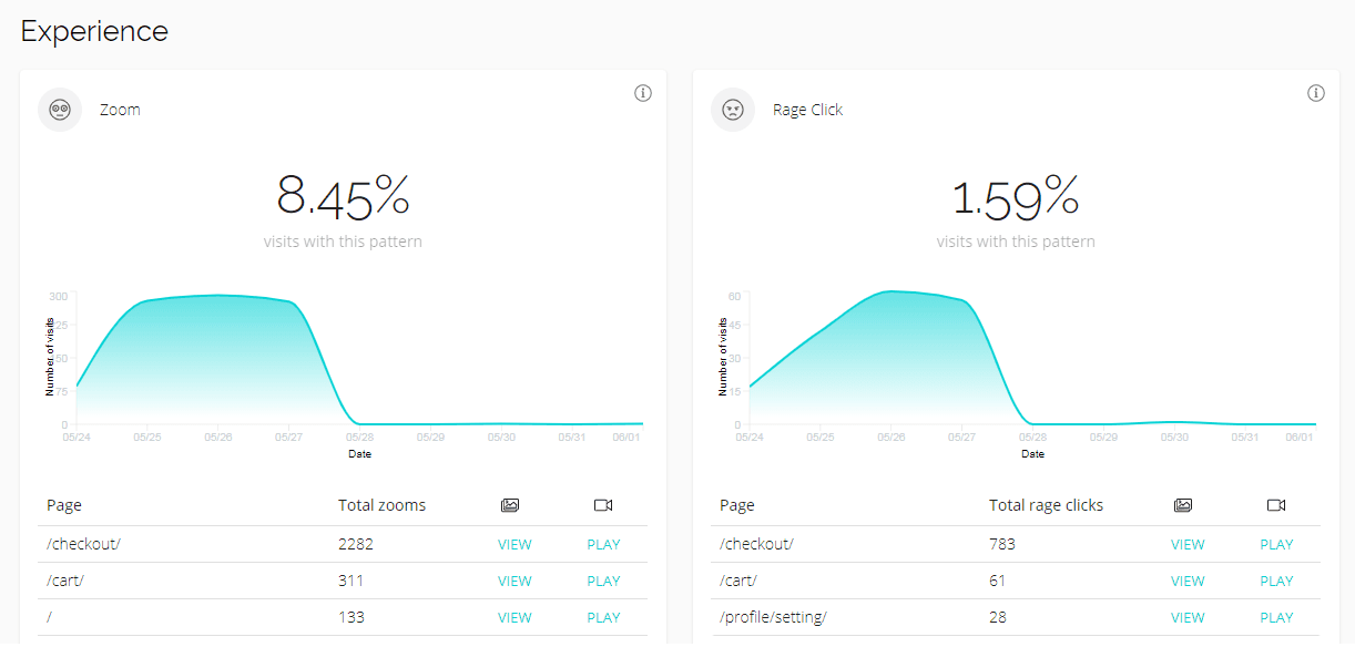
4. Broken forms & buttons (Signal: Rage Clicks)
EXPERIENCE METRICS INDICATOR: Rage Clicks
FRUSTRATION LEVEL: Aggravation
Rage Clicks occur when a user repeatedly clicks on a specific element that doesn't respond, typically indicating a broken button, a dead link, or a misleading design element.
You already have everything – you saw the shoelace weave up close, you decided on “arctic white” despite the fact that this “mustard yellow” was equally insane, you also chose the right size. Bravo! The last step ahead of you – completing the purchase form. First field, second, third – they all go smoothly. And suddenly this beautiful story ends. You can’t fill in the next one, even though you are trying hard. And here comes the next indicator – Rage Clicks. You click and click and bam… you’re reminded of your childhood when while racing in Need For Speed, you kept clicking on the arrow to turn right, but nothing happened and you crashed your car against the railings.
Rage Clicks are a key signal for conversion rate optimisation experts to watch.. They appear quite often and mostly on forms, so if you see them in your dashboard, react immediately so you don’t lose a customer who has come this far.
5. Checkout blockers (Signal: Rage Key Presses)
EXPERIENCE METRICS INDICATOR: Rage Key Presses
FRUSTRATION LEVEL: Pissed off
DESCRIPTION: that’s the higher level of frustration, if not the highest. Usually it’s a derivative or an intensified version of Rage Clicks.
Somehow you were able to fill out the form. You’re on the last leg of the customer journey. A quick glance at the form, filled-out perfectly, mom would be proud. You click “confirm”. Nothing’s happening. You tell yourself to relax, there’s a lot of data, maybe the site needs to think for a while. You click again. And again (Rage Clicks indicator goes crazy). You do so a dozen more times. Rage Clicks turn into Rage Key Presses.
Your aggravation and frustration turn into total annoyance and you simply bang on the keys of your innocent keyboard aggressively. The time you have put into finding the perfect product is wasted because you can’t finalize your purchase. Maybe one of the boxes hasn’t been ticked, but the lack of the right message makes you furious and you’re unable to find the mistake you’ve made earlier. As soon as this indicator starts to grow, it is essential for you to investigate the situation. This is the ultimate level of frustration and if it appears, it means you have to act immediately!
How to avoid bugs on your website?
Sounds familiar? These bugs have surely happened to you, and those who are lucky enough probably got to experience all of them at least once in a lifetime (read: you tried to buy something via Internet, but ultimately failed). Don’t worry, mistakes happen, and according to an old saying – only those who do nothing make no mistakes. It’s normal that with all the improvements to your business and website, bugs will appear.
However, what is most important is to REACT! As soon as possible. Faster even than ASAP! Whether the bugs appear at the beginning or maybe somewhere at the very end of the shopping path – each of them will make the customer leave your site without buying the desired product.
So analyze and act based on customer journey data, never just gut feelings.

FAQs
Q: How do I know if my website is "user-friendly" without asking users directly?
A: Use behavioral analytics tools. Instead of surveys, observe actual behavior. Metrics like low time-on-page, high bounce rates, and specific frustration signals (rage clicks, chaotic movement) are direct, unbiased indicators that your user interface is causing problems.
Q: Why is "content zooming" considered a negative signal?
A: On modern responsive websites, users shouldn't need to zoom to read text or see product details. Frequent zooming indicates your site isn't optimized for mobile, forcing users to work harder to consume content. This friction often hurts the mobile user acquisition funnel.
Q: What is the fastest way to fix these common bugs?
A: Prioritize bugs based on their impact on your conversion path. Fix broken forms (Rage Clicks) first, as they directly block sales. Then address navigation issues (Chaotic Movement) that confuse the user flow. Using a tool like CUX helps you rank these issues by their frequency and impact on your goals.