December 9, 2025
5 min read
5 common UX mistakes that are killing your website conversion rates
What makes for the bad UX and UI experience? Is it too flashy design? Or maybe not user-friendly content? Or the misplacement of CTA buttons?

UX design mistakes like complex navigation, inaccessible forms, and broken user flow create user frustration. Identifying these errors with behavioral analytics tools is the first step to fixing your conversion path and reducing churn rate.
When designing websites, we often focus on the appearance - button arrangement, colors, and original graphics. However, there are some universal UX design errors that can make even the best website unobservable. See: How to create more “observable” webpages? Part one.
5 most common UX mistakes in 2025
Even though errors in UX design may be endless, there are at least 5 that can be found in almost every work. Check if they are also undermining your projects.
1. Inaccessible mobile touch targets
The 'Checkout Problem' has evolved into a mobile accessibility crisis. On small screens, placing buttons or checkboxes too close together leads to the 'Fat Finger' error, triggering immediate rage clicks.
If a user can't tap a specific element easily or if validation errors appear without clear instructions, they experience a spike in user frustration that often ends the session immediately.
2. Form fatigue - Asking for too much data
What makes a bad UX? Engagement. Or – to put it right – too much engagement required from the customers. Imagine creating a simple contact form for your company. You’ll probably need to know your client’s personal data. But since you’re a B2B company, you’d also like to know what company they work for. Or if they have a senior position – no need to waste time on interns, right? And maybe you’d like to give them a special birthday offer, so the “date of birth” it is! And now you’ve got yourself one of the most common UX mistakes.

Over-detailed forms are one of the most popular sources of user frustration. Reducing even one form field may boost its conversions by as much as 26% (source: wpforms.com)
3. Complex customer journey
Often, people responsible for the web design want to present clients with… everything. Especially those who work closely with the marketing department. As entrepreneurs, we want users to have the greatest possible choice, familiarize themselves with our offer, read all blog entries, and get a grip on our return policy. A convoluted customer customer journey map confuses users. They shouldn't need a compass to find the checkout; the conversion path must be linear and intuitive. If you try to force them to visit every page, they will leave.

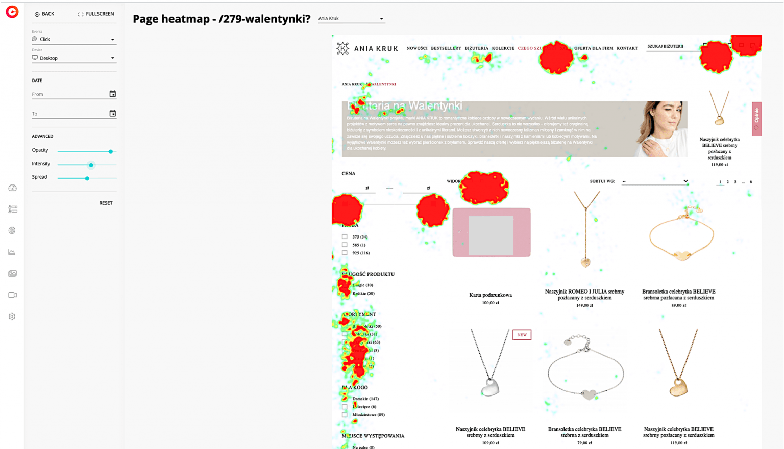
The jewellery company found out about the need to shorten customer journeys thanks to cux.io, by tracking the increasing rage click rates of its Valentine’s campaign. See: Know your user’s mind: Valentine’s campaign analysis – The aniakruk.pl Case
4. Single page applications (SPAs) without event tracking
Modern sites often use SPAs (Single Page Applications) where the URL never changes. While sleek, this creates a data blindspot. If you don't configure your user behavior analytics correctly for these dynamic elements, you miss critical customer journey data.
You won't know if the user left at the 'Address' step or the 'Payment' step because the URL remained static throughout the entire process.
5. Pop-up paralysis: Distracting content on mobile
The customer journey should be as simple and intuitive as possible. Don’t forget that the user has already made his way to your product. If you are promoting a specific item, set the campaign in such a way that a single click leads to a sale. Additional distractions in the form of pop-ups with newsletter subscriptions, discounts, and lead magnets can irritate users unnecessarily!

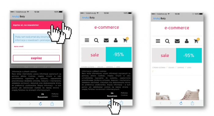
A view of the shoe e-commerce displayed on mobile – it takes even a few minutes (!) before the customer sees the product.
Before you start asking yourself, “What is wrong with UX?”, double-check if you haven’t made one of those common UX design mistakes. Your users will most certainly thank you for it. 🙂
Frequently asked questions (FAQs)
Q: What is the most damaging UX mistake for SEO?
A: Poor mobile responsiveness and slow Core Web Vitals are the most damaging. Google uses mobile-first indexing, so if your mobile user interface is hard to use or loads slowly, your rankings will drop regardless of desktop quality.
Q: How do I find UX mistakes without hiring a researcher?
A: You can use behavioral analytics tools like CUX. Features like visit recordings allow you to watch real users interacting with your site. If you see them rage-clicking a button or repeatedly scrolling up and down (yoyoing), you've found a UX error.
Q: Why are detailed forms considered bad UX?
A: Every extra field increases cognitive load and friction. Studies show that removing just one field can significantly increase conversion rate. Users prioritize speed and privacy; asking for unnecessary data (like a phone number) creates suspicion and leads to cart abandonment.
