August 21, 2025
9 min read
Improve user experience - 6 Ways to Optimize Your eCommerce UX
User Experience (UX) is extremely important for eCommerce business owners. It is the aspect that has become the wind beneath the wings of successful online stores.

How to optimize your eCommerce User Experience?
You must be familiar with the irksome design of some stores that you might have visited yourself. The problem might lie in slow page loading times, the inefficiency of the product search feature, or inadequate information on the site. There are all sorts of little things that accumulate to form a poor experience in an online shopping store.
In this post, we shall explore different methods and share tips to avoid such blunders and optimize the user experience to the maximum potential.
1. Having Exemplary Navigation
The navigation of a website, part of UX design, often comes as an after-thought while designing the eCommerce store. There’s no doubt that the home and product sites and the content need careful curation. However, they render ineffectual if your visitor cannot find the page they are looking for.
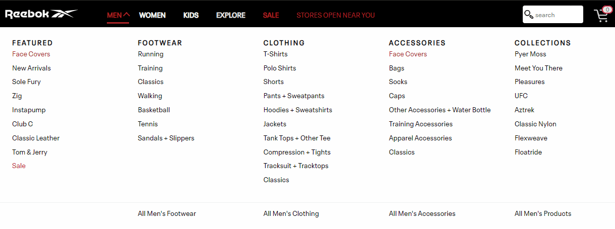
So, the first step toward a UX-optimized eCommerce website is sorting the navigation between different pages through breadcrumbs. Essentially, there are three types of website navigation patterns; global, hierarchical, and local.
In the first type, global navigation, the link, and category menu is identical across all the pages of the website. Whereas in hierarchical navigation, the navigation categories keep changing based on the context of each page. Lastly, local navigation refers to the inbound links on your product pages or blogs.

Global navigation system by Reebok for effortless browsing experience - Source
2. Appealing Product Pages
You must optimize your product pages to provide a satisfactory eCommerce user experience that converts. One of the fatal vices of online shopping is that the customers cannot touch or feel the product, talk to a salesperson about their requirement or try that product on. Sure, the technological advances have made it possible to assist shoppers through live chats or virtual try-on, but it’s complicated nevertheless.
Therefore, you need appealing product pages to ensure that the customer does not abandon the purchase or buy the wrong product due to a lack of information. Both the scenarios end with an unsatisfied customer, commonly known as a bad user experience, and lower conversions.
Your product pages must have the following attributes:
- Explanatory names
- Clear images with an enlarged view
- Price along with delivery service charges
- Different options like size or color
- Defining features mentioned concisely
- Clear buttons to add the item to the cart
3. Efficient Search Results
User Experience experts greatly emphasize the search bar and filtering options for an eCommerce website, and rightly so. Over 61% of eCommerce sites provide a below-average search performance. Optimizing your search bars can really set your store apart from these competitors and help become a differentiator in your niche.
You can try the following best practices for a seamless on-site search experience:
- Place the search engine tactfully to make it easily accessible
- Accommodate typos or autocorrect spellings so that simple errors don’t return in empty result page
- Offer synonym results via an agile search engine algorithm
- Present relevant products instead of empty search pages, just in case you do not sell the product the user searched for
- Keep the search result pages mobile-friendly
CUX Case study - Ania Kruk
There is no such a thing as a “better customer”. But you should be aware that customers gathered from the campaign more than anyone should have a flawless customer journey and best user experience on your website during their shopping process.

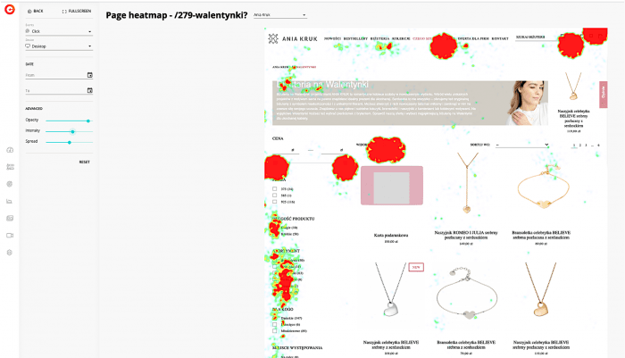
aniakruk.pl campaign analysis: CUX grouped Heatmap
During Valentines session cux.io conduct a quick analysis of aniakruk.pl a polish jewelry brand campaign. Based on CUX Heatmaps, aniakruk.pl discovered how to optimize the option of filtering products at a price, which was crucial for her customers. See what CUX discovered from the analysis of historical or current data on the campaign.
4. Streamlining the Checkout Process
Nobody is fond of tedious checkout processes, and over 17% of the shoppers state that as the primary reason for cart abandonment. So why make them go through an ordeal by incorporating unnecessarily long forms, or rigid payment options.
Easy checkout process
You can reduce the friction in the checkout process by making it straightforward. One of the ways is to reduce the number of form fields necessary to place an order. Guest checkouts also make for a valuable addition to your checkout pathway, improving overall eCommerce UX.
Various possibilities for payment
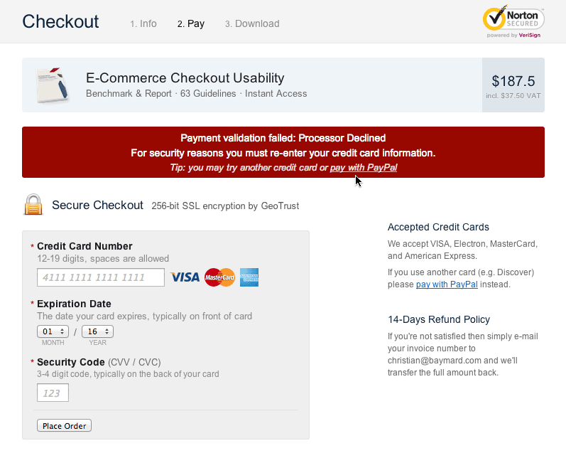
Next, you can elevate the payment process by accepting the different types of payment options. Factor in our user’s preferences and set up secure gateways and digital wallets for easy shopping. To make your website even more convenient and user-friendly, you should care about visual elements. You can display clear reasons if a payment does not succeed and provide an alternative method in the notification shown below.

CUX Case study: Online Footwear Shop
A large player in the footwear industry was able to find in 2 minutes the source of frustration and customer problems during the checkout. Thanks to CUX, he saved hours of watching recordings, and he could focus on implementing the solution on the website. Not to mention the possibility of improvement, and experience optimization.
If you want to know details, on how CUX helped this online store, just drop us a short line at team@cux.io.
5. Indulge in Social Selling
You must consider an omnichannel approach to maximize the reach of your brands. Social media platforms have become an inseparable part of our lives. Social selling allows you to capitalize on the fact and connect with prospective costumes with utter ease. The fact that 83% of online shoppers discover new products through Instagram or Facebook makes the practice all the more appealing.
Further, you can find a lot of insightful data through social listening that can help curate strategies to improve your user experience. Also, these platforms act as constant social proof for your potential customer’s perusal. They can check out the comments, reviews, and feedback for your products that can help them make better shopping decisions.
6. Clear Call-To-Action Buttons
Creating a good Call-To-Action (CTA) is a work of art mixed with a little bit of science behind it. You can create these buttons clearly and actionable to enhance the eCommerce UX of your website. You can identify a good CTA by determining whether it is noticeable, contrasted with the page, appeals to click, and clearly mentions the action to be taken.
Short or personalized CTA?
eCommerce websites are known to keep it simple with short phrases such as “Buy now” or “Add to cart” and these work efficiently so far. You can also try your hand at personalized CTA buttons, as they can offer approximately 202% increase in conversion rates. You can be as creative with the copy as you like, just don’t make it ambiguous.
Size of Call-To-Action
While the CTA button should be noticeable too, do not make it too large such that it sticks out like a sore thumb. Lastly, bold lettering should do the trick of attracting the attention of the visitors and inspiring them to take action.
Optimize user experience
Exceptional user experience will always remain a differentiating factor in the eCommerce industry. You can always rely on the good UX to satisfy your buyers. It's easier to increase conversions and outperform your competitors by creating eCommerce stores that meet customers' expectations.
These tips will help you create a simple, adaptable, user-friendly eCommerce site with clear graphics, interesting copy, and an easy checkout procedure. All of these features combine to give your customers exactly what they want and can significantly enhance sales.
If you want to optimize user experience in your e-commerce, even more, you can use a dedicated tool for it.
UX and Analytics Automation Tool
That eliminates sales inhibit in e-commerce
CUX is the very first UX & Analytics Automation tool that allows e-commerce to identify their users' behavior patterns and learn about customer experience. The tool enables you to understand individual customer segments, track campaign traffic, make decisions after A/B tests, and even detect rogue partners on sites and in web applications.
See CUX lightning demo to learn more!
Increase user experience by finding experience metrics
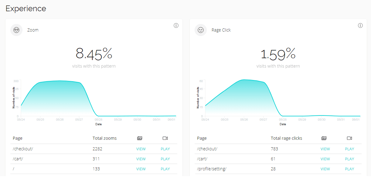
One of CUX's features is Experience Metrics, which allows you to discover places in your eCommerce where your customers' user experience is not as good as it should be. Experience Metrics finds pain points on the website that make the customer angry and frustrated.

Based on CUX Experience Metrics, you will see indicators that will inform you that something bad is happening on your websites and that customers are going through difficulties trying to deal with it.
It's all about smarter analytics
CUX allows you quickly :
- increase conversion,
- turn frustrated users into happier users
- build significant market advantage thanks to pre-analyzing experiences
- identifying behavioral patterns.
Quantifying User Experience, benchmarks, and custom segmentation are all you need to boost your positive customer experience and increase sales in your online store.
About the author
Oliver Thyra is the head SaaS copywriter and content strategist at Your Marketing Digest. His intense passion for marketing and his engineering background in software engineering has made him a guy who understands how to sell software subscriptions with words. In his free time, Oliver enjoys quality time with his pets (he has got 4 golden retrievers!).

